(This Post is part of my 30 day Data Visualization Challenge – you can follow along using the ‘challenge’ tag!)
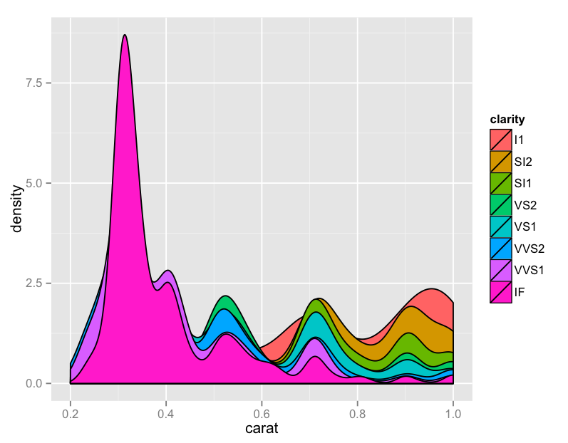
I, too, was disappointed in yesterday. I spent some time looking at the data, and figured maybe a different approach would yield more information – part of what made yesterday’s chart a bit unwieldy was the amount of information. I reduced the subset to only carat weight below one, and plotted a density graph of carat alone, with fill color defined with a cohort’s clarity:
Thoughts:
– Now we’re cooking! Look at that – it looks like under half a carat, the “IF” clarity completely dominates the other categories. This was not at all evident from yesterday’s visualization.
– Again, using the Brewer Palette – these are really sharp, and have palette options for lots of different use cases. Is it weird that I’m excited about this?
– Remember, these are not all of the diamonds, but only those with the color “J”
Code:
library(ggplot2)
jsmaller = subset(diamonds, color="J", carat <= 1)
plot.jsmaller = qplot(carat,data=jsmaller,fill=clarity, binwidth=.01, geom="density")
plot.jsmaller + scale_color_brewer(palette="Set1")
