Tag: challenge

30 Day Challenge Post Mortem

tumblr_nnsdgysxUx1sfie3io1_1280

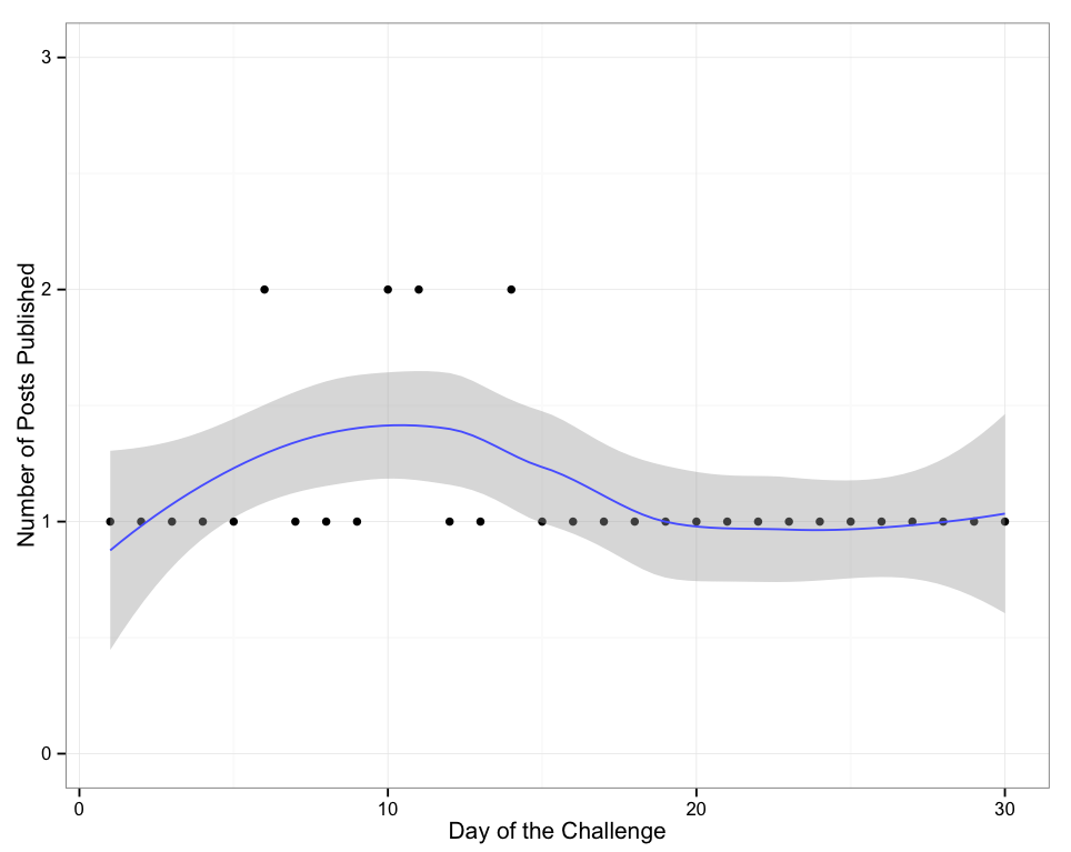
I’ll admit up front that working with R every day for thirty days, producing a new visualization every day, was both harder and easier than I thought it was going to be.

There were days when I felt like I was on fire, found an interesting thread and produced four or five days of visualizations all at once. There were also days where it felt like a real drag, just trying to find something that even looked a little interesting.

There is some debate on the internet about whether a thirty day time period is sufficient to make something a habit – I can’t really speak to that, as creating a habit wasn’t the goal. The goal was to become familiar with a particular R library (ggplot2), and I think that goal has certainly been accomplished.

I really liked this format – thirty days is long enough to feel possible, for the finish line to always be in sight, but still requires discipline and buy-in. As far as a way to jump start a new skill, we’ll have to see a bit farther down the line, but I certainly feel about a hundred times more comfortable with ggplot2 than I did when I started the whole thing.

I’d recommend this format to folks who are looking to mix up their personal development. The hardest part is choosing an activity that will be interesting and challenging to do, thirty times, every day, but without picking something so large that it becomes onerous or negatively stressful.

I had considered, for instance, to use a new statistical analysis every day for thirty days. That would probably have been a bit too large a bite for me, and I would have really struggled to accomplish it.

Now, the only question remaining is: what should my next challenge be?

DVC Day 30: EL FIN

(This Post is part of my 30 day Data Visualization Challenge – you can follow along using the ‘challenge’ tag!)

Screen Shot 2015-05-11 at 4.34.04 PM


Thoughts:

– Boom.
– Longer post-mortem in the works about both this challenge in particular and doing a thing every day for 30 days in general.
– Thanks for tuning in 🙂

Code:

> library(ggplot2)
> qplot(day, n, data=dh) + scale_y_continuous(limits=c(0,3)) + geom_smooth() + ylab("Number of Posts Published") + xlab("Day of the Challenge") + theme_bw()

DVC Day 29: Almost There!

(This Post is part of my 30 day Data Visualization Challenge – you can follow along using the ‘challenge’ tag!)

Here we have the final graph that I presented to the rest of my colleagues in discussing the difference between our chat durations with Paid customers vs. our Business customers.

Screen Shot 2015-05-11 at 3.51.39 PM Thoughts:

– This is more effective than the box-and-whisker graph because it illustrates that while Paid and Business chats may have roughly the same median duration, the breakdown of the chat duration field is not the same – note how the Business chats bump out on the longer end. Very interesting.
– Note also that the duration piece has been changed to a log scale – this is to handle some of those huge outliers.

Code:

> library(ggplot2)
> mydata = read.csv(“~/olark_april_2015.csv”)
> q = ggplot(mydata,aes(log(chat_duration))) 
> q + geom_density(aes(fill=factor(group_title, labels=c("Business","Paid")) , alpha=1/4)) + ylab("% of Total Chats")

DVC Day 28: Enhance!

(This Post is part of my 30 day Data Visualization Challenge – you can follow along using the ‘challenge’ tag!)


Following the highly smushed boxes of yesterday, my next step was to limit our y-axis only to the lower end, where the vast majority of our data points were:

Screen Shot 2015-05-11 at 4.02.23 PM


Thoughts:
– Now we can see that our Business folks (on the left) and our larger cohort of all Paid users (on the right), have roughly the same median chat duration.
– In the interest of curiosity, though, it seems like this deserves more consideration, especially with the monster number of outliers. Box-and-whisker graphs are also not largely well understood, so bringing this before a broad audience wouldn’t work well if the goal is to communicate a difference (or lack of difference) in an effective way.

Code:

> library(ggplot2)
> mydata = read.csv(“~/olark_april_2015.csv”)
> p = ggplot(mydata, aes(group_title, chat_duration)) 
> p + geom_boxplot() + scale_y_continuous(limits=c(0,5000))

DVC Day 27: Practical Applications

(This Post is part of my 30 day Data Visualization Challenge – you can follow along using the ‘challenge’ tag!)

As we finish out the 30 days, I’ll actually be using an example of work that I did to test a hypothesis at Automattic. We currently provide live chat support to two cohorts of our customers, the folks who purchase WordPress.com Business, and our customers who have purchased any upgrade at all (mostly domains and WordPress.com Premium). There has been a longstanding assumption that our live chats with Business customers were longer in duration – they have access to Ecommerce options, as well as no-cost access to our entire library of Premium Themes.

So, I ported our live chat data out of Olark and into R, and threw together a box plot:

Screen Shot 2015-05-11 at 4.02.00 PM

Thoughts:
– If this looks wrong somehow, that’s because it is: our box is so small as to be flattened. All we really see are the massive upward outliers.
– This clearly does not do anything to help us decide which style of chat tends to be longer in duration – our Business folks are on the left here, and our Paid customers are on the right.
– Clearly the next step is figuring out how to change this display so we can see what those boxes look like in a zoomed-in view.

Code:

> library(ggplot2)
> mydata = read.csv(“~/olark_april_2015.csv”)
> p = ggplot(mydata, aes(group_title, chat_duration)) 
> p + geom_boxplot()