(This Post is part of my 30 day Data Visualization Challenge – you can follow along using the ‘challenge’ tag!)
As I get more comfortable poking around in ggplot2, I’ve come to a place where I want to step back a bit – qplot is 100% awesome and is a great way to get started with this library, but I want to try my hand at putting together plots fully manually, if only to better understand the way that ggplot2 works more generally. So, I did! Here’s a plot where we’re trying to confirm that across diamond color, as carat size increases, price tends to increase as well. You recall, especially with J, this seemed to be in question:
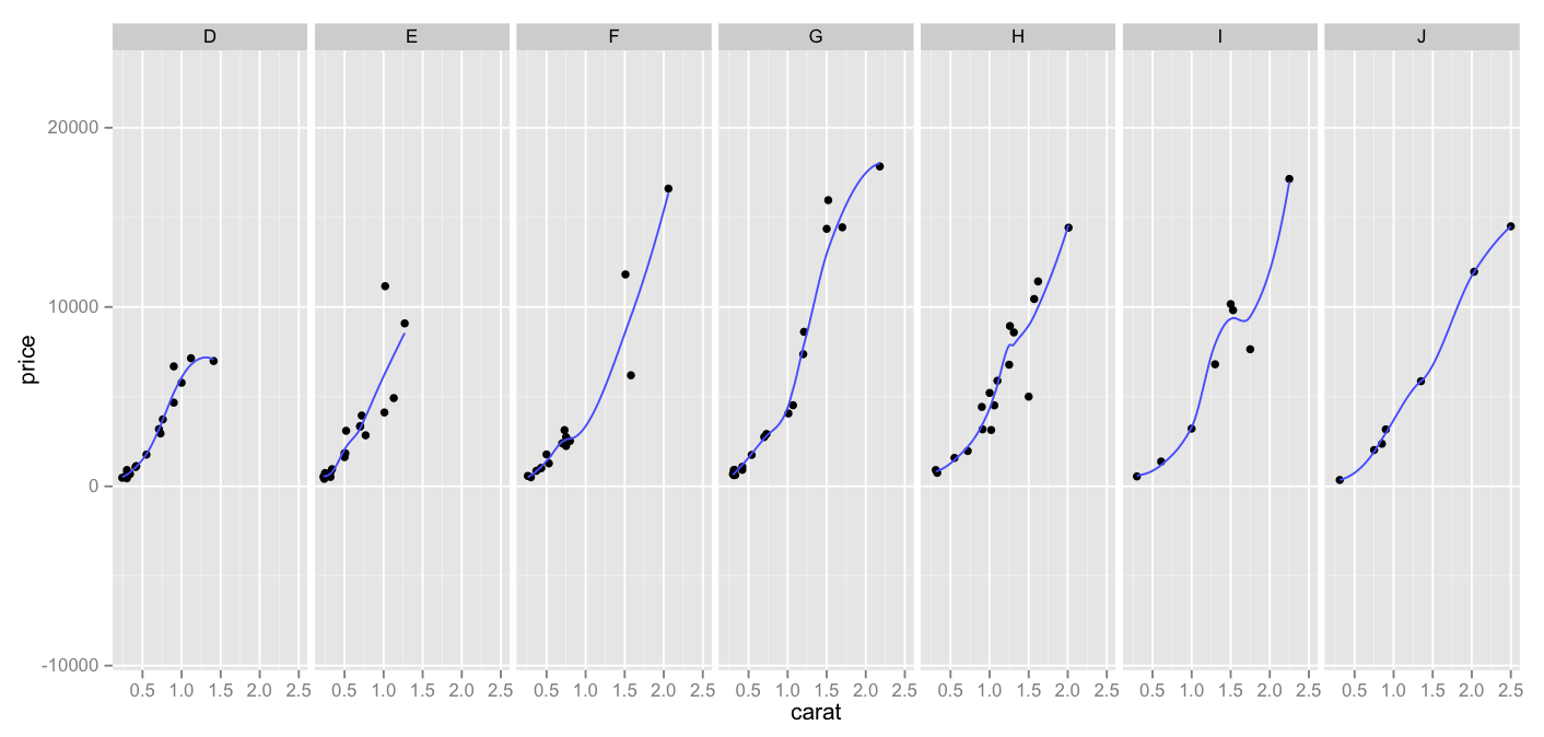
Thoughts:
– Again I pulled a sample from the (huge) diamonds dataset. It’s the same smaller sample that I used in earlier days.
– You’ll note that instead of using a single qplot, we put together a few lines of code.
– Here we have three things going on – points indicating carat v. price, a facet_grid indicating each color on its own facet (rather than representing them via different colors or symbols) and a smoother line, indicating general path of the data (as opposed to a more jagged point-to-point line)
– I prefer this to the all-dots-on-board approach that I was using before – while it was colorful, and interesting, I don’t think it illustrated the relationships as well as splitting them up into facets, like this.
Code:
library(ggplot2)
set.seed(1410)
dsmall <- diamonds[sample(nrow(diamonds),100),]
dvc <- ggplot(dsmall, aes(carat,price)) + geom_point()
dvc + facet_grid(. ~ color) + geom_smooth(fill=NA)
