(This Post is part of my 30 day Data Visualization Challenge – you can follow along using the ‘challenge’ tag!)
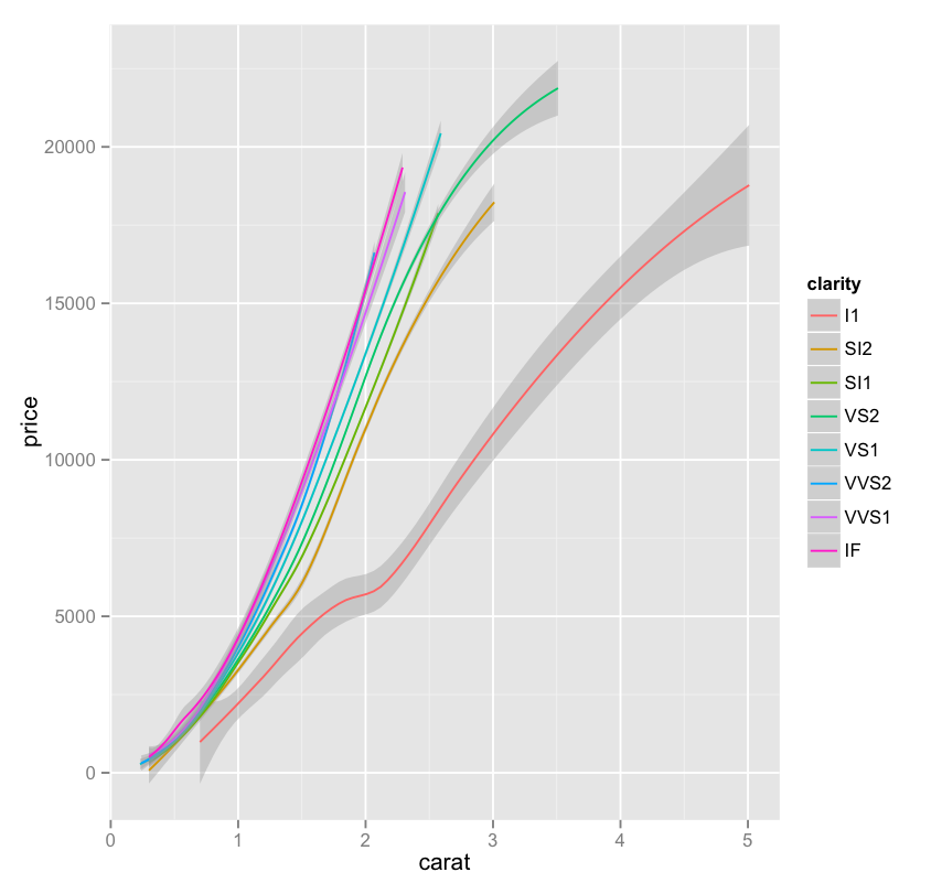
In noodling around with the different options of the qplot function (and there are plenty), I found myself going back and forth on the geom option – here’s one of the possible inputs, smooth, which takes us from yesterday’s graph to one of just very smooth lines, with a shading indicating the standard deviation of that particular collection of data:
Thoughts:
– This is a really interesting example of another case where we trade some visual precision for more visual utility – for example,that same graph using arguably more a more precise plotting of lines looks like a total, and useless, mess.
– The green line is particularly interesting, since it appears to plateau at a certain point – about the same place where it is the only remaining clarity.
Code:
library(ggplot2)
only.j <- subset(diamonds, color=="J")
j <- qplot(carat, price, data=only.j, color=clarity, geom=c("smooth"))
j

Look out for l1 it looks way more deviant than the others!