(This Post is part of my 30 day Data Visualization Challenge – you can follow along using the ‘challenge’ tag!)
After taking a look at the different colors of diamonds in a sample, I noticed that the diamonds colored “J” appeared to be unusual outliers. Following this tack, I created a subset of the larger diamond data set that contained _only_ the J colored diamonds – then, plotted that on the same carat/price graph we’ve seen, but with color now indicating the diamond’s clarity:
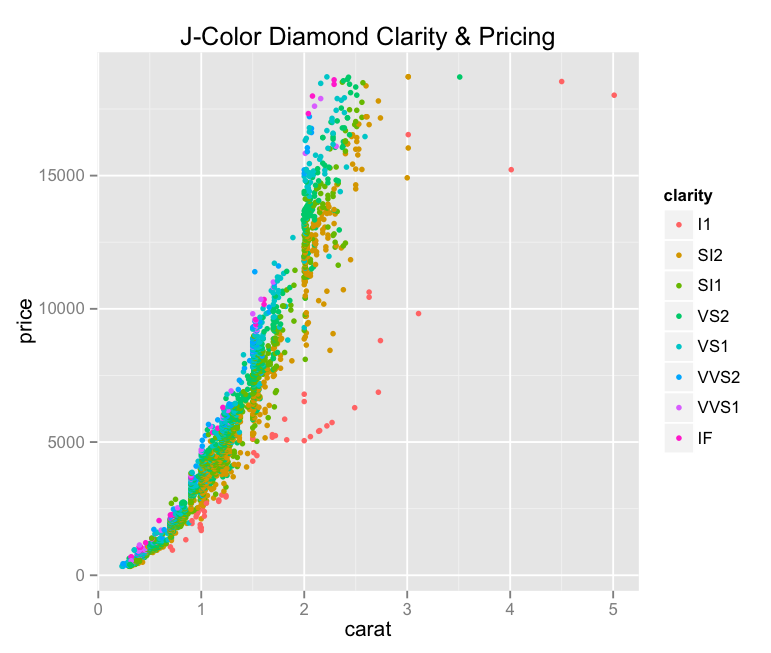
Thoughts:
– I also added a title, and started using variable names as I build around a data frame, which makes it much easier.
– We can see at least one of those vertical striations that we saw in the original data set.
– It looks like the outliers on the low-price-high-carat scale of the J-colored diamonds are larger but less valuable than their peers.
– This graph is a bit muddy, but we can for sure see what look like trends in clarity correlating with price as we go from orange to green to pink/purple.
Code:
library(ggplot2)
only.j <- subset(diamonds, color=="J")
j <- j <- qplot(carat, price, data=only.j, color=clarity, size=I(1.5))
j <- j + ggtitle("J-Color Diamond Clarity & Pricing")
j

There’s a lot more data down in the sub 1.0 carat range than above. What happens when you restrict the set to less than a carat?