Tag: data

DVC Day 15: Request #3!

(This Post is part of my 30 day Data Visualization Challenge – you can follow along using the ‘challenge’ tag!)

In chatting a bit with another friend and colleague, Martin, he suggested that I look into two things – applying the diamonds data set to a spider chart, to more clearly illustrate exactly how differences look across sets, and to look into log-log plots.

It turned out, for a few reasons, that spider charts are a bit out of my pay grade (for now), but log-log plots are actually very interesting, and can totally show us something kind of interesting.

If, like me, you haven’t thought about logarithms in a dog’s age, here’s an article on Forbes that can get you started down the rabbit hole. The oversimplified and probably incorrect TL:DR is this – a standard hockey-stick up-and-right graph can be very useful to show change that is occurring, but sometimes a log-log plot can more clearly illustrate _the rate of change of that change._

That is, a company may be growing, but is the rate of growth accelerating?

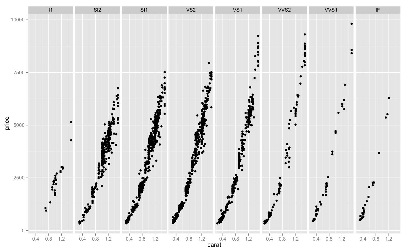
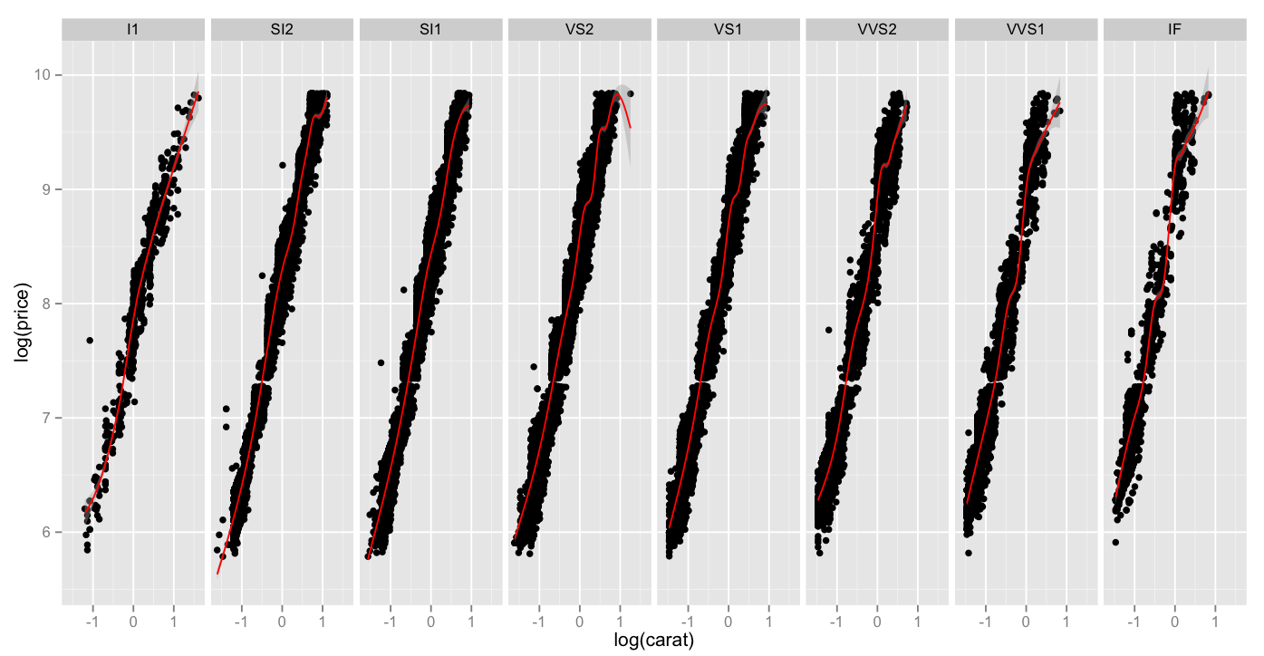
Here is a chart of log(carat) vs. log(price), which as you recall, when compared in a non-log format, had a pretty classic hockey-stick shape. When we compare the same values in a log-lot plot, here split up across clarities and a red smoothing geom applied, we can see that while all clarities move up-and-right as the carat weight increases, high clarities do so _at a faster rate_.

Screen Shot 2015-04-27 at 8.42.49 PM

Thoughts:
– I got ahead of myself and sort of dumped all my thoughts above the graph today. Sorry!

Code:

> library(ggplot2)
> log.facet <- ggplot(diamonds, aes(log(carat),log(price))) + geom_point()
> log.facet + facet_grid(. ~ clarity) + geom_smooth(color="red")

DVC Day 14: Request #2

(This Post is part of my 30 day Data Visualization Challenge – you can follow along using the ‘challenge’ tag!)

Responding to a comment (again from Ben!) on Day 11, I’ve used the more atomic plotting function of ggplot to break the data into another separate facet_grid – which definitely helps to illustrate (a little) the relationship between clarity and price on J colored diamonds:

Screen Shot 2015-04-25 at 8.30.09 PM

Thoughts:
– This may be less colorful, but it is a much more clear representation of the data at hand – we can see that as we progress from left to right, the apparent upward slope of price becomes steeper.
– It’s interesting that there is a real density change in the 2000-5000 price as we move from left to right – that’s where the lion’s share of column 2, 3 and 4 are, but in 5, 6 and 7 they narrow out. Maybe this is a cultural thing, re: pricing expectations for certain clarities?

Code:

> library(ggplot2)
> jsmall <- subset(diamonds, color=="J" & carat <= 1.5)
> j.facet <- ggplot(jsmall, aes(carat, price)) + geom_point()
> j.facet + facet_grid(. ~ clarity)

DVC Day 13: Dropping the “Quick”

(This Post is part of my 30 day Data Visualization Challenge – you can follow along using the ‘challenge’ tag!)

As I get more comfortable poking around in ggplot2, I’ve come to a place where I want to step back a bit – qplot is 100% awesome and is a great way to get started with this library, but I want to try my hand at putting together plots fully manually, if only to better understand the way that ggplot2 works more generally. So, I did! Here’s a plot where we’re trying to confirm that across diamond color, as carat size increases, price tends to increase as well. You recall, especially with J, this seemed to be in question:

Screen Shot 2015-04-25 at 10.13.07 AM

Thoughts:
– Again I pulled a sample from the (huge) diamonds dataset. It’s the same smaller sample that I used in earlier days.
– You’ll note that instead of using a single qplot, we put together a few lines of code.
– Here we have three things going on – points indicating carat v. price, a facet_grid indicating each color on its own facet (rather than representing them via different colors or symbols) and a smoother line, indicating general path of the data (as opposed to a more jagged point-to-point line)
– I prefer this to the all-dots-on-board approach that I was using before – while it was colorful, and interesting, I don’t think it illustrated the relationships as well as splitting them up into facets, like this.

Code:

library(ggplot2)
set.seed(1410)
dsmall <- diamonds[sample(nrow(diamonds),100),]
dvc <- ggplot(dsmall, aes(carat,price)) + geom_point()
dvc + facet_grid(. ~ color) + geom_smooth(fill=NA)

DVC Day 12

(This Post is part of my 30 day Data Visualization Challenge – you can follow along using the ‘challenge’ tag!)

I, too, was disappointed in yesterday. I spent some time looking at the data, and figured maybe a different approach would yield more information – part of what made yesterday’s chart a bit unwieldy was the amount of information. I reduced the subset to only carat weight below one, and plotted a density graph of carat alone, with fill color defined with a cohort’s clarity:

Screen Shot 2015-04-21 at 8.47.58 PM

Thoughts:
– Now we’re cooking! Look at that – it looks like under half a carat, the “IF” clarity completely dominates the other categories. This was not at all evident from yesterday’s visualization.
– Again, using the Brewer Palette – these are really sharp, and have palette options for lots of different use cases. Is it weird that I’m excited about this?
– Remember, these are not all of the diamonds, but only those with the color “J”

Code:

library(ggplot2)
jsmaller = subset(diamonds, color="J", carat <= 1)
plot.jsmaller = qplot(carat,data=jsmaller,fill=clarity, binwidth=.01, geom="density")
plot.jsmaller + scale_color_brewer(palette="Set1")

DVC Day 11: Yes I Take Requests

(This Post is part of my 30 day Data Visualization Challenge – you can follow along using the ‘challenge’ tag!)

Back on Day 6, my buddy Ben asked:

There’s a lot more data down in the sub 1.0 carat range than above. What happens when you restrict the set to less than a carat?

Let’s take a look! You’ll recall that on Day Six we were looking at only the diamonds of the J color – my favorite, I always root for the underdog – viewing carat v. price with each point’s color indicating its clarity.

Screen Shot 2015-04-21 at 8.28.47 PM

Thoughts:
– Also at Ben’s suggestion, I’ve started reading about Brewer Color Scales, which are really interesting, useful, and all around awesome.
– We’ve reduced our area to only “J” color diamonds below 1.5 carats – a bit more than requested but I was curious!
– I’ve also added an alpha value, which helps us to deal with the dot density a bit. It essentially sets the opacity of a single point, so areas of lower density can be more easily identified, since they’re a bit faded.
– This visualization is not great. It’s sort of hard to see what’s happening here. There must be a better way to display this in a way that can provide some insights.

Code:

library(ggplot2)
jsmall <- subset(diamonds, color=="J" & carat <= 1.5)
plot.j.small <- qplot(carat, price, data=jsmall, color=clarity, size=I(1.5), alpha=I(.5))
plot.j.small + scale_color_brewer(palette="Set1")