(This Post is part of my 30 day Data Visualization Challenge – you can follow along using the ‘challenge’ tag!)
In chatting a bit with another friend and colleague, Martin, he suggested that I look into two things – applying the diamonds data set to a spider chart, to more clearly illustrate exactly how differences look across sets, and to look into log-log plots.
It turned out, for a few reasons, that spider charts are a bit out of my pay grade (for now), but log-log plots are actually very interesting, and can totally show us something kind of interesting.
If, like me, you haven’t thought about logarithms in a dog’s age, here’s an article on Forbes that can get you started down the rabbit hole. The oversimplified and probably incorrect TL:DR is this – a standard hockey-stick up-and-right graph can be very useful to show change that is occurring, but sometimes a log-log plot can more clearly illustrate _the rate of change of that change._
That is, a company may be growing, but is the rate of growth accelerating?
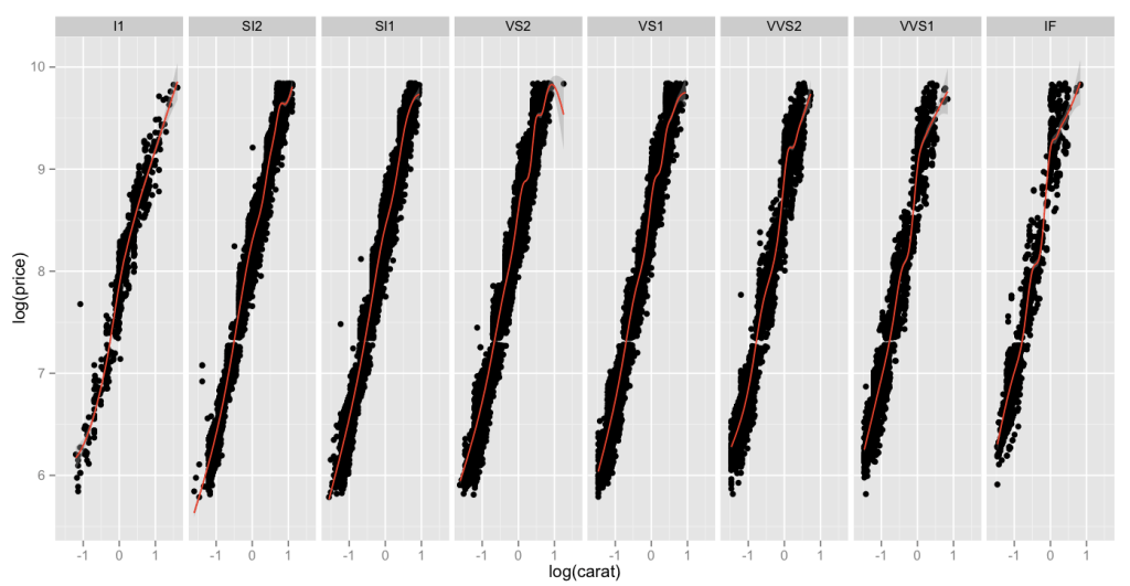
Here is a chart of log(carat) vs. log(price), which as you recall, when compared in a non-log format, had a pretty classic hockey-stick shape. When we compare the same values in a log-lot plot, here split up across clarities and a red smoothing geom applied, we can see that while all clarities move up-and-right as the carat weight increases, high clarities do so _at a faster rate_.
Thoughts:
– I got ahead of myself and sort of dumped all my thoughts above the graph today. Sorry!
Code:
> library(ggplot2)
> log.facet <- ggplot(diamonds, aes(log(carat),log(price))) + geom_point()
> log.facet + facet_grid(. ~ clarity) + geom_smooth(color="red")
