Use the Data You Have: Explanation and Context

Most conference talks are the worst. We can acknowledge that, among ourselves, right?

Many folks don’t properly prepare, they don’t expend any care into their visuals, and they fail to bring anything like the kind of value that they could.

I’m not saying that people who present at conferences are the worst. By and large they’re actually the opposite – they’re some of the best and brightest and most interesting people in an industry, and that’s why they’ve been invited to speak at a conference.

(sometimes they’re even being paid to speak at the conference)

I think it’s more that socially, at least Americans, we conceive of public speaking the same way we conceive of learning mathematics. It’s like a light switch. You’ve got it or you don’t.

“I’m not a math person.”

That’s nonsense of course. But, it’s pervasive, and it unfortunately really sells us short on both ends – folks who have a ton of amazing things to say don’t use their voice because they think it’s simply the way, when it’s more a matter of work, and practice, and preparation.

The other side of the coin are the folks who think they’ve got it, that charisma, and preparation is for squares who don’t have it.

That’s nonsense, too, naturally.

This is a long way of providing context for a series of Posts I’ll be doing over the next few weeks. I’m speaking at SupConf later this month, and I am determined to provide a mountain of value to the folks who have travelled to San Francisco and trusted me with twenty minutes of their time. My talk is called Use The Data You Have. 

It’s about how customer support teams can create value within their companies and for their customers without running experiments or trying new and crazy stuff – just by using the data they already have.

One way I am assuring myself that I can provide some value is by creating the value way ahead of time, in the form of these blog posts, that will serve as a supplement to what I discuss in the talk.

(Don’t worry, they’ll be helpful in their own way as well, I’m not going to keep anything special away from folks who aren’t going to the conference, or are reading this in the future)

In some way this blog series is a way for me to hedge my bets: even if I completely mess up the presentation and look like a total buffoon, I’ll still be able to click through to my final splash slide and cry for redemption; look, look, all hope is not lost!

Plus, this series is going to be somewhat dry, with some screenshots and Google Analytics talk, which is important, but super dry and not at all suited for an in-person conference talk.

Watch this space!


Quartz, Atlas and the Y Axis

I’ve gone into a bit of a rabbit hole this weekend. One of WordPress.com VIP‘s biggest sites, Quartz, has a growing set of data visualizations, charts, graphs, etc, at their new branch, Atlas.

In poking around, I found myself at the Github repo for their visualization tool, Chartbuilder. This tool is pretty rad – if you have node on your computer you can run it locally, or you can also use their hosted version, here.

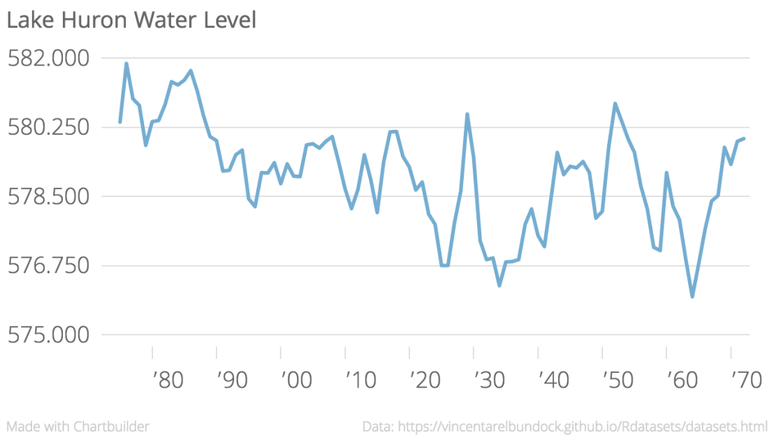
It took maybe six minutes to go from a CSV I’d never seen before (Lake Huron water levels) to a pretty nice little viz:

Lake_Huron_Water_Level_LakeHuron_chartbuilder (1).png

It offers a lot of flexibility, as well as simple ease of use. Anyone armed with a (properly formatted) CSV can go from numbers on a page to a useful visualization really quickly. I expect I’ll pick this up when I need something to go from numbers to graphic quickly, and the CSV is already nicely formatted.

I do love R and R Studio (ggplot2 for life), but sometimes I don’t want to spend much time tweaking something to be just-so, or searching Google (or Stack Exchange) for something I haven’t seen before.

One thing that’s worth bringing up, as data visualization becomes more accessible and easier for everyone to use, is this: going from a CSV to a chart can be an act of interpretation, and can create a message from the data that may skew your readers toward your perception.

(I’d argue that part of creating moral visualizations is presenting the data in a way that allows the individual to maintain positive liberty, but that’s a bigger discussion for another time)

Consider the viz above – you’d be understandably concerned about the water levels of Lake Huron – they do seem to be varying widely over the past century, and with a general downward trend.

This is a sneaky trick of the Y Axis – note that it only represents a span of eight feet. Look again, with the Y axis starting at 500:

Lake_Huron_Water_Level_LakeHuron_chartbuilder.png


… or, as some purists demand, with the Y axis starting at zero:


Lake_Huron_Water_Level_LakeHuron_chartbuilder (2).png


I am excited to mix Chartbuilder into my data toolbox, but remember well, dear readers: as visualization tools become easier to use and as the ideas of Big Data become stronger and stronger, there are lots and lots of ways irresponsible or malicious folks can weasel the facts.

Be vigilant out there, gang.

Also, happy Mother’s Day 🙂

Salary Transparency Debate Tonight

This is going to be a pretty weird evening, you guys.

I was invited (somehow) to be one of the guests for PBS’ Point Taken pre-show Twitter Debate.

(Has there ever been a more 2016 sentence written?)

Their episode tonight is on Salary Transparency, which, as many of you know, I have opinions about.

The other guests, who I expect will be mopping the floor with me intellectually, are Marcie Bianco, Lauren Voswinkel, and Fatima Goss Graves.

This whole experience will be an outstanding opportunity for humility, at least on my part.  Please do feel free to Tweet comical and sarcastic asides at me while I try to look like a real professional.

The Twitter piece goes from 10P – 11P EDT, and the show itself airs tonight at 11P EDT. You can watch it here.

Transparency in Action: Skip Levels and Feedback

If you’ve been following along this blog for a while, you probably already know my position on transparency – in salary, in the workplace, and especially for the successful remote team.

(If you are new here, I’d recommend this post about what I call Aggressive Transparency, and this older Post on how Buffer approaches salary transparency is pretty good too!)

I have weekly check-ins with the head of Happiness at WordPress.com and my lead, Andrew Spittle. We also do somewhat less regular 3-2-1 sessions, which are a kind of roadmap slash feedback amalgam.

One thing that Andrew suggested for this latest session was for him to request anonymous feedback from my team – but, rather than going to me, this feedback would go directly to him. He’d read it, filter out what he saw as the helpful or constructive parts, and we’d discuss it in the 3-2-1. Sort of a remote, anonymous, skip level interview.

After a thunderbolt of pure animal terror, then a moment of thought, and I agreed with some enthusiasm.

Wait a second, you might be asking yourself – don’t you do quarterly anonymous Leadback Surveys with your team already? How many surveys can you put these poor people through?

The answer is, yes, I do solicit anonymous feedback from my team four times a year, and I do get a lot of really productive and helpful value out of those surveys. The reason this was exciting to me was mostly in having that information come to me filtered through the perspective of someone removed, someone whose opinion I respect.

This is important because, like any human, when I read these Leadback survey results, I  know they’re about me. Even though I put them together, even though I wrote the questions very specifically trying to find out where I’m going wrong and where I can be improving – it still is an emotional process to read them. It’s still an effort to remove my ego from the experience and focus instead on the What and the How.

The natural emotional and ego driven sensitivity to this sort of survey is a dangerous combination for me in this context, because leading a remote team is something I care deeply about, and is something I genuinely want to get better at.

This means that I am in the sometimes tough role of receiving this input, and also interpreting it, and trying to interpret it objectively and without my own best interests in mind – to find the Truth, and to use it to improve.

Of course, this kind of interpretation is impossible.

So, hearing that Andrew was interested in hearing the same information, and drawing his own conclusions – this was a great opportunity indeed. More than half of my team replied to his request, and from it he sussed out some really useful points of improvement, some of which were not even on my radar.

One piece that was harder, and in retrospect I’m not sure why, was putting together this feedback and presenting it back to my team. After all, they provided it, it wasn’t going to be any mystery to them where I could be doing a better job.

For some reason I was hesitant to make the content of this conversation with Andrew public – it felt like something I needed to guard, to keep private. Spending some time with that, I couldn’t find a good reason to keep it inside, and at least one great reason to share it with the team.

That great reason being, they needed to know that their voice was heard, and that I was going to keep working really hard to become qualified to lead the team. After all, my gut instinct, my default choice, to keep it locked in my own brain-vault, would actually be the worst case scenario – can you imagine being requested to provide feedback on your lead, and then never hearing about it again? 

So, I posted about it. Now they know. And they know I know, which is the important part.

If you’re curious – and of course you should be, I’m seriously burying the lead here – the three big pieces of feedback from my team vis a vis the Spittle Filter:

  • “Be easier to disagree with.”
  • “Be more hands off.”
  • “Spend more time doing the work that we do.”


STILL Visualizing the Support Driven Survey

I have been away from the blog for a bit – during the time I normally spend blogging and thinking about blogging, I’ve been spending trying to get to know a new tool for my R toolbox, a web app platform for R called Shiny.

Those of you who have been around for a while are familiar with my bizarre love of the intersection of information and design that data visualization represents, especially given that I am neither a statistician nor an artist.

(The heart wants what the heart wants!)

As demonstrated previously on this blog, I learn best by doing (hence my 30 day visualization sprint wherein I took a dive into the R library ggplot2) – so after going through the Shiny tutorial, I gave it a try, and pushed live my first ever web app, a super rudimentary user-adjustable visualization of the recent Support Driven compensation survey.

So, here’s a link. Check it out. I would genuinely and with a full heart appreciate your feedback.