Tag: data

DVC Day 5

(This Post is part of my 30 day Data Visualization Challenge – you can follow along using the ‘challenge’ tag!)

One of the neat things that ggplot2 can do is take a plot like yesterday’s, and automatically add a third dimension of data – for today I added the column “color,” which indicates the color of the actual diamond measured, as a “color” aesthetic:

k0WNm7WHTW-3000x3000

Thoughts:
– Now we’re getting somewhere: we can see that yes, more carats tend to be associated with a higher price (with some outliers) but it also looks like certain colors (D,E, F) tend to be lower-priced and/or lower-carat. An interesting question might be to ask which of those factors is more strongly correlated with particular colors.
– We can also see that two of our outliers in this sample are both Js, so there may be interesting things to look into w/r/t that particular color.
– It might be nice to have some sort of drawn line or curve indicating a general trend, as well as maybe a trend per color?

Code:

library(ggplot2)
set.seed(1410)
dsmall <- diamonds[sample(nrow(diamonds),100),]
qplot(carat, price, data=dsmall, size=I(2), color=color)

DVC Day 4

(This Post is part of my 30 day Data Visualization Challenge – you can follow along using the ‘challenge’ tag!)

Yesterday’s visualization tried to handle this issue of data point density by reducing the actual size of the dots on the graph. The ggplot2 book (there’s a book!) recommends giving sampling a try. I’ve written a little about sampling and abstraction in the past – so let’s give it a try!

9wQlBfMiCS.thumb
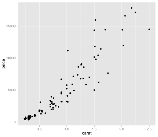
Now we’re cooking! I did have to bump the size of the points back up, as only 100 of those specks were not visually very helpful – but now we have a bit more of a visually intuitive sense of what we’re looking at, without guessing at the larger, imprecise ink blots.

It’s interesting, to me as a lapsed philosopher, that sampling (as an abstraction) necessarily means that we’re giving up precision (in the form of data points), but we’re doing so to gain another type of precision, that is, quick and accurate visual meaning. I’m dropping the Pros list – I’ll try to cover positive thoughts in the body of each Post.

Thoughts:
– What does it mean, though? We can see that there appears to be some sort of relationship between price and carat – how do the other factors come into play here? Are there other patterns at work?
– How can I make it prettier?
– It bothers me that “price” is vertical still. Dangit.

Code:

library(ggplot2)
set.seed(1410)
dsmall <- diamonds[sample(nrow(diamonds),100),]
qplot(carat, price, data=dsmall, size=I(2))

DVC Day 3

(This Post is part of my 30 day Data Visualization Challenge – you can follow along using the ‘challenge’ tag!)

After plotting the full dataset on a price vs. carat graph, one of the problems that occurred was this idea of dot density – proper data scientists probably have a more technical term for it. That is, with so many data points, it’s hard to tell how “deep” a dot is, since a visible dot may represent a larger number of data points.

It seems like one possible solution would be to reduce the size of each dot – since each dot’s size may be causing it to visually encroach upon nearby data points, making the graph less visually useful. So, I tried that:

W-OdoQsbso-1200x1200

Pros:
– Offers a bit more nuance to the visual distribution of price vs. carat.
– Maintains the interesting vertical separations

Cons:
– This isn’t really a solution – with this number of data points, we still experience these big ink blots of imprecise “Well, there’s lots.” areas.
– It bothers me that “price” is vertical still. I forgot about that.
– The small size of the dots makes it tough to quickly distinguish outliers from a dirty laptop screen.

Code:

library(ggplot2)
qplot(carat, price, data=diamonds, size=I(1/3))

DVC Day 2

(This Post is part of my 30 day Data Visualization Challenge – you can follow along using the ‘challenge’ tag!)

Yesterday, I plotted the distribution of price among the diamonds dataset. One of the cons was that it showed the price distribution, but failed to really indicate any reasoning or correlations that might help us understand _why_ the prices were the way that they were.

To add some more depth, I’ve plotted price on the y-axis and carat on the x-axis:YVMu-ibRnV-1200x1200

If you’ve spent any time with this dataset (or R tutorials) you’ve likely seen this visualization before.

Pros:
– Gives us more context about what might be driving price
– Has some interesting vertical separations
– Looks like it may indicate a trend

Cons:
– The density of points makes it hard to tell whether a dot is one data point deep or 300 data points deep
– It bothers me that “price” is vertical
– What are those vertical separations about?

Code:

library(ggplot2)
qplot(carat, price, data=diamonds)

DVC Day 1

(This Post is part of my 30 day Data Visualization Challenge – you can follow along using the ‘challenge’ tag!)

For the first visualization, I kept it very simple:

lqB4fx5kCg-3000x3000

Pros:
– Easy to read
– Provides some value: we can see that price does not have a normal distribution, but rather a positively skewed leptokurtic distribution. I am only 70% sure I’m using these words correctly. (Thanks Professor Field!)

Cons:
– Not really very interesting
– Pretty ugly
– Does not explain what determines price, only what the prices are.

Code:

library(ggplot2)
qplot(price, data=diamonds)