(This Post is part of my 30 day Data Visualization Challenge – you can follow along using the ‘challenge’ tag!)
Yesterday’s visualization tried to handle this issue of data point density by reducing the actual size of the dots on the graph. The ggplot2 book (there’s a book!) recommends giving sampling a try. I’ve written a little about sampling and abstraction in the past – so let’s give it a try!
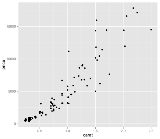 Now we’re cooking! I did have to bump the size of the points back up, as only 100 of those specks were not visually very helpful – but now we have a bit more of a visually intuitive sense of what we’re looking at, without guessing at the larger, imprecise ink blots.
It’s interesting, to me as a lapsed philosopher, that sampling (as an abstraction) necessarily means that we’re giving up precision (in the form of data points), but we’re doing so to gain another type of precision, that is, quick and accurate visual meaning. I’m dropping the Pros list – I’ll try to cover positive thoughts in the body of each Post.
Thoughts:
– What does it mean, though? We can see that there appears to be some sort of relationship between price and carat – how do the other factors come into play here? Are there other patterns at work?
– How can I make it prettier?
– It bothers me that “price” is vertical still. Dangit.
Code:
library(ggplot2)
set.seed(1410)
dsmall <- diamonds[sample(nrow(diamonds),100),]
qplot(carat, price, data=dsmall, size=I(2))
