(This Post is part of my 30 day Data Visualization Challenge – you can follow along using the ‘challenge’ tag!)
For the first visualization, I kept it very simple:
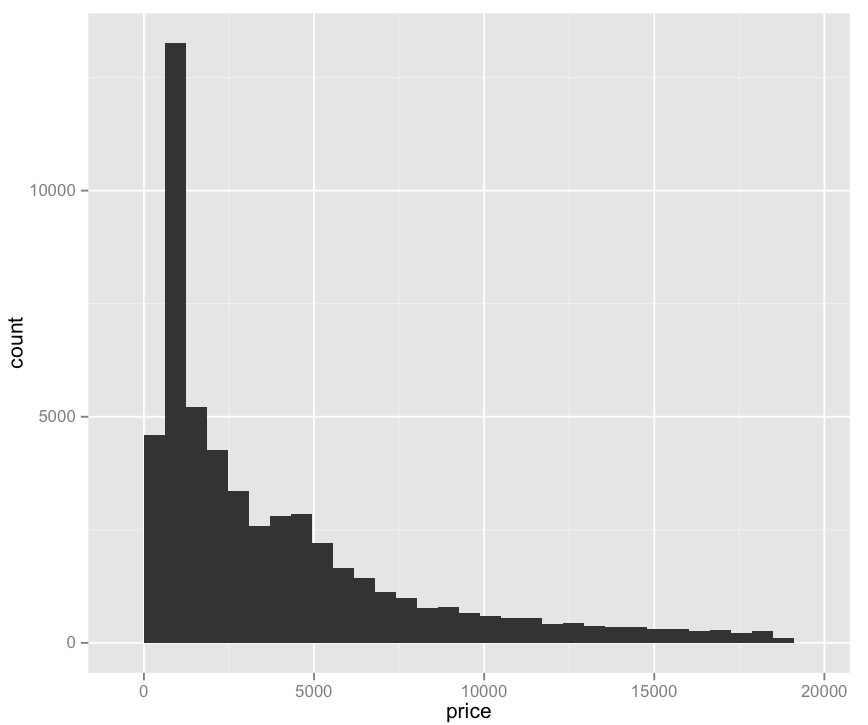
Pros:
– Easy to read
– Provides some value: we can see that price does not have a normal distribution, but rather a positively skewed leptokurtic distribution. I am only 70% sure I’m using these words correctly. (Thanks Professor Field!)
Cons:
– Not really very interesting
– Pretty ugly
– Does not explain what determines price, only what the prices are.
Code:
library(ggplot2)
qplot(price, data=diamonds)

Leptokurtic? Really? Does DVC stand for Data Visualization Challenge? Cuz I’m thinkin’ it’s for Daily Vocabulary Challenge! 🙂
It can stand for both!