(This Post is part of my 30 day Data Visualization Challenge – you can follow along using the ‘challenge’ tag!)
Back on Day 6, my buddy Ben asked:
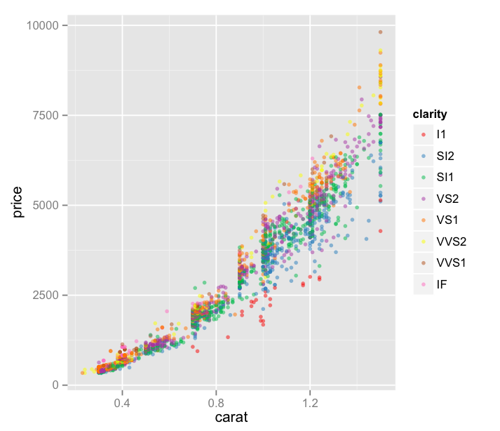
There’s a lot more data down in the sub 1.0 carat range than above. What happens when you restrict the set to less than a carat?
Let’s take a look! You’ll recall that on Day Six we were looking at only the diamonds of the J color – my favorite, I always root for the underdog – viewing carat v. price with each point’s color indicating its clarity.
Thoughts:
– Also at Ben’s suggestion, I’ve started reading about Brewer Color Scales, which are really interesting, useful, and all around awesome.
– We’ve reduced our area to only “J” color diamonds below 1.5 carats – a bit more than requested but I was curious!
– I’ve also added an alpha value, which helps us to deal with the dot density a bit. It essentially sets the opacity of a single point, so areas of lower density can be more easily identified, since they’re a bit faded.
– This visualization is not great. It’s sort of hard to see what’s happening here. There must be a better way to display this in a way that can provide some insights.
Code:
library(ggplot2)
jsmall <- subset(diamonds, color=="J" & carat <= 1.5)
plot.j.small <- qplot(carat, price, data=jsmall, color=clarity, size=I(1.5), alpha=I(.5))
plot.j.small + scale_color_brewer(palette="Set1")

Small multiples might help. Instead of one chart, have one chart per clarity, all with the same size with synced axis limits.
Then stack them vertically or horizontally to easily compare the dist for each clarity.
I think I can do that with facet_grid – stay tuned!