Tag: R

DVC Day 9: Bin What?

(This Post is part of my 30 day Data Visualization Challenge – you can follow along using the ‘challenge’ tag!)

Testing our earlier hypothesis that the vertical striations in our data were due to a preference for “whole” carat numbers – or at least more readable numbers, we can look at a single-variable histogram:
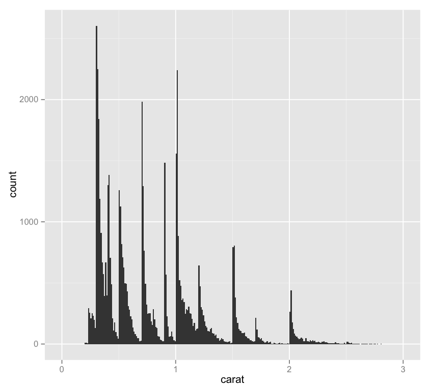
Screen Shot 2015-04-20 at 8.19.26 PM

Thoughts:
– One interesting thing about this chart is the importance of binwidth, which sets the resolution of the data in a histogram – for instance, here’s this same chart with a binwidth of .15 rather than .01. It loses a lot of the utility of the chart above!
– It might be interesting to display a second variable here in a way other than on the y-axis – as a color maybe.

Code:

library(ggplot2)
qplot(carat, data=diamonds, geom="histogram", binwidth=.01, xlim=c(0,3))

DVC Day 8: Messin’ with (More) Geoms

(This Post is part of my 30 day Data Visualization Challenge – you can follow along using the ‘challenge’ tag!)

In playing a bit more with the qplot geoms call, I spent some time with the “jitters” geom, which has nothing to do with coffee, as it turns out. Jittering is a neat method to fight against the same sort of dot density that we saw earlier in the challenge – it creates a larger space for points to be plotted, which makes a visualization more readable. Here’s this same visualization without the jittering.

tXFnUXRYOl-3000x3000

Thoughts:
– The more I do this, the more I realize I don’t know about diamonds.
– The more I do this, the more I realize I don’t yet understand about R and visualizing data. It’s exciting!
– There’s a consistent pattern to the clarity layers that we see, repeating what looks like 3 times, yellow, green, blue, pink, and then again, and then a third time, with pink sort of stretching skyward. What’s that about?
– The “J” color continues to be interesting to me – why is it so jumbled up when the others seem to be at least somewhat orderly? It also reaffirms our previous findings, where we noticed that “J” diamonds seemed to be outliers (in a bad way) on the price vs. carat chart.

Code:


library(ggplot2)
qplot(color, price/carat, color=clarity, data=diamonds, geom="jitter")

DVC Day 7: Messin’ with Geoms

(This Post is part of my 30 day Data Visualization Challenge – you can follow along using the ‘challenge’ tag!)

In noodling around with the different options of the qplot function (and there are plenty), I found myself going back and forth on the geom option – here’s one of the possible inputs, smooth, which takes us from yesterday’s graph to one of just very smooth lines, with a shading indicating the standard deviation of that particular collection of data:


nZnlIFK9Qn-3000x3000

Thoughts:
– This is a really interesting example of another case where we trade some visual precision for more visual utility – for example,that same graph using arguably more a more precise plotting of lines looks like a total, and useless, mess.
 The green line is particularly interesting, since it appears to plateau at a certain point – about the same place where it is the only remaining clarity.

Code:


library(ggplot2)
only.j <- subset(diamonds, color=="J")
j <- qplot(carat, price, data=only.j, color=clarity, geom=c("smooth"))
j

DVC Day 6

(This Post is part of my 30 day Data Visualization Challenge – you can follow along using the ‘challenge’ tag!)

After taking a look at the different colors of diamonds in a sample, I noticed that the diamonds colored “J” appeared to be unusual outliers. Following this tack, I created a subset of the larger diamond data set that contained _only_ the J colored diamonds – then, plotted that on the same carat/price graph we’ve seen, but with color now indicating the diamond’s clarity:

ziakw_LTPh-3000x3000

Thoughts:
– I also added a title, and started using variable names as I build around a data frame, which makes it much easier.
– We can see at least one of those vertical striations that we saw in the original data set.
– It looks like the outliers on the low-price-high-carat scale of the J-colored diamonds are larger but less valuable than their peers.
– This graph is a bit muddy, but we can for sure see what look like trends in clarity correlating with price as we go from orange to green to pink/purple.

Code:


library(ggplot2)
only.j <- subset(diamonds, color=="J")
j <- j <- qplot(carat, price, data=only.j, color=clarity, size=I(1.5))
j <- j + ggtitle("J-Color Diamond Clarity & Pricing")
j

DVC Day 5

(This Post is part of my 30 day Data Visualization Challenge – you can follow along using the ‘challenge’ tag!)

One of the neat things that ggplot2 can do is take a plot like yesterday’s, and automatically add a third dimension of data – for today I added the column “color,” which indicates the color of the actual diamond measured, as a “color” aesthetic:

k0WNm7WHTW-3000x3000

Thoughts:
– Now we’re getting somewhere: we can see that yes, more carats tend to be associated with a higher price (with some outliers) but it also looks like certain colors (D,E, F) tend to be lower-priced and/or lower-carat. An interesting question might be to ask which of those factors is more strongly correlated with particular colors.
– We can also see that two of our outliers in this sample are both Js, so there may be interesting things to look into w/r/t that particular color.
– It might be nice to have some sort of drawn line or curve indicating a general trend, as well as maybe a trend per color?

Code:

library(ggplot2)
set.seed(1410)
dsmall <- diamonds[sample(nrow(diamonds),100),]
qplot(carat, price, data=dsmall, size=I(2), color=color)