Tag: R

DVC Day 24: Depth Charging

(This Post is part of my 30 day Data Visualization Challenge – you can follow along using the ‘challenge’ tag!)

When we charge a bit more into the question of depth and cut, an interesting thing happens: it looks as though the depth for a particular cut becomes more narrow up to Premium – but then loosens up a bit for Ideal:

Screen Shot 2015-05-06 at 7.22.42 PM

Thoughts:
– Six days to go!

Code:

> library(ggplot2) > ggplot(diamonds, aes(depth, carat)) + geom_point() + facet_grid(. ~ cut) + theme_minimal()

DVC Day 23: Finally Some Depth

(This Post is part of my 30 day Data Visualization Challenge – you can follow along using the ‘challenge’ tag!)

In getting back to my roots a little (by which I mean playing with qplot), I found kind of an interesting relationship between depth and cut. I was noodling around with some of the measures to see if they had any obvious impact on price – but instead we see this fairly strict ordering between cut and depth.


Screen Shot 2015-05-06 at 7.04.47 PM

Thoughts:
– This makes it appear that depth and cut have some sort of relationship, though what sort of relationship that is is not totally clear.
– It’s interesting to see that there is not an apparent correlation between depth and price, even while the cuts correlate to certain depths. Practically all of the outliers sit at relatively low price points.

Code:

> library(ggplot2)
> qplot(depth, price, data=diamonds, alpha=I(.5), color=cut)

DVC Day 22: Bear or Dance?

(This Post is part of my 30 day Data Visualization Challenge – you can follow along using the ‘challenge’ tag!)

Another built-in bit of ggplot2 is the ability to take any bar chart (geom_bar() or geom=”bar”) and convert it into something like this, called a coxcomb chart. It’s sort of like a pie chart, but with more information density:

Screen Shot 2015-05-04 at 8.45.21 PM

Thoughts:
– I’m not totally sure when a chart like this is more appropriate (or more readable, or more understandable) than a simple bar graph of the same data. It’s definitely cool looking, but I don’t know if it conveys information in a meaningfully better way.
– When total data points collected vary so much (look at VS2 vs IF for example), it’s hard to tell how the smaller groups really compare to the larger ones. This is a problem with bar charts too, though.

Code:

> library(ggplot2)
> p <- ggplot(diamonds, aes(clarity, fill=cut)) + geom_bar()
> p
> p + coord_polar()

DVC Day 21: Spice of Life, etc etc

(This Post is part of my 30 day Data Visualization Challenge – you can follow along using the ‘challenge’ tag!)

In exploring the R ecosystem, I find myself exposed to lots of different ways of doing things, along with a real diversity of opinion on how to best present data. I’m working on studying up on that but for now, I’m satisfied giving lots of different things a try. In noodling around on R Bloggers, I found Dean Attali and his ggplot2 add-on library, ggExtra, that lets us do stuff like this:

Screen Shot 2015-05-04 at 8.01.24 PM

Thoughts:
– It really is remarkable how powerful open source software is. When you’re steeped in it every day, it becomes almost second nature, the obvious way.
– I like the sidebar histograms; they present a novel reply to dot density problems. I can see them being useful in a great number of cases, especially with larger, more spread out scatter plots.

Code:

> library(ggplot2)
> library(ggExtra)
> p <- ggplot(diamonds, aes(carat,price)) + geom_point() + theme_classic()
> ggExtra::ggMarginal(p, type="histogram")

DVC Day 20: Hotter Heat Map

(This Post is part of my 30 day Data Visualization Challenge – you can follow along using the ‘challenge’ tag!)

After spending some more time thinking about heat maps, and reading the way that a few other R practitioners approach them (huge thanks to R-bloggers), I noodled around a bit with our earlier heat map to produce this, which I think is a bit more readable, and also provides more visually appetizing data bites:

Screen Shot 2015-05-03 at 8.27.09 AM

Thoughts:
– Using only one triangle of the correlation matrix means we don’t repeat data, and it makes it a bit easier to pick out what you’re seeing.
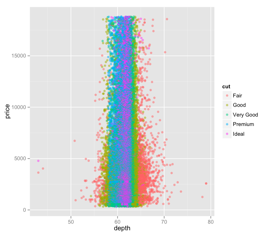
– It’s interesting to see that depth and table have nearly no impact on price, and are in fact negatively correlated with one another – making negative correlations more visually apparent is a good move, I think, as it was tough to tell “uncorrelated” from “negatively correlated” in the last iteration of the heat map.

Code:

> library(ggplot2)
> library(reshape2)
> dnum <- diamonds[c(1,5:10)]
> dnum <- sapply(dnum, as.numeric)
> dcor <- round(cor(dnum), 2)
> get_lower_tri <- function(cormat){
+ cormat[lower.tri(cormat)] <- NA
+ return(cormat)
+ }
> dcor <- get_upper_tri(dcor)
> melted_dcor <- melt(dcor)
> ggplot(data = melted_dcor, aes(Var2, Var1, fill=value)) + geom_tile(color="white") + scale_fill_gradient2(low="blue", high="orange", midpoint=0, limit=c(-1,1)) + theme_minimal()