(This Post is part of my 30 day Data Visualization Challenge – you can follow along using the ‘challenge’ tag!)
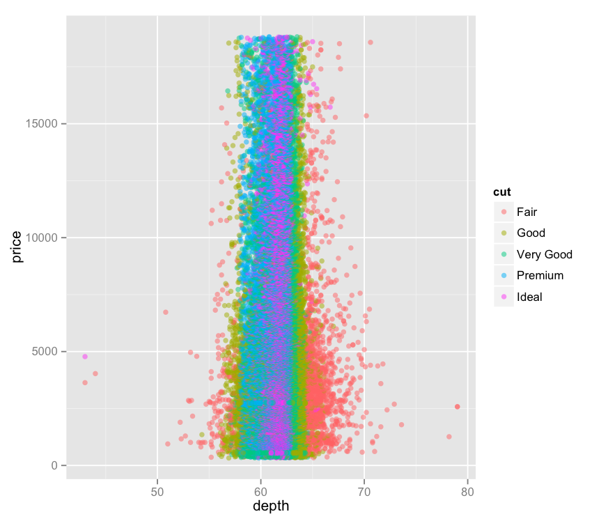
In getting back to my roots a little (by which I mean playing with qplot), I found kind of an interesting relationship between depth and cut. I was noodling around with some of the measures to see if they had any obvious impact on price – but instead we see this fairly strict ordering between cut and depth.
Thoughts:
– This makes it appear that depth and cut have some sort of relationship, though what sort of relationship that is is not totally clear.
– It’s interesting to see that there is not an apparent correlation between depth and price, even while the cuts correlate to certain depths. Practically all of the outliers sit at relatively low price points.
Code:
> library(ggplot2)
> qplot(depth, price, data=diamonds, alpha=I(.5), color=cut)
