(This Post is part of my 30 day Data Visualization Challenge – you can follow along using the ‘challenge’ tag!)
In exploring the R ecosystem, I find myself exposed to lots of different ways of doing things, along with a real diversity of opinion on how to best present data. I’m working on studying up on that but for now, I’m satisfied giving lots of different things a try. In noodling around on R Bloggers, I found Dean Attali and his ggplot2 add-on library, ggExtra, that lets us do stuff like this:
Thoughts:
– It really is remarkable how powerful open source software is. When you’re steeped in it every day, it becomes almost second nature, the obvious way.
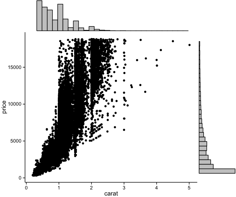
– I like the sidebar histograms; they present a novel reply to dot density problems. I can see them being useful in a great number of cases, especially with larger, more spread out scatter plots.
Code:
> library(ggplot2)
> library(ggExtra)
> p <- ggplot(diamonds, aes(carat,price)) + geom_point() + theme_classic()
> ggExtra::ggMarginal(p, type="histogram")
