(This Post is part of my 30 day Data Visualization Challenge – you can follow along using the ‘challenge’ tag!)
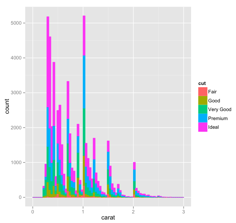
One third of the way through! I’ve played a bit with yesterday’s histogram and done two things – added ‘cut’ as a fill, and widened the bin a bit, just for looks:
Thoughts:
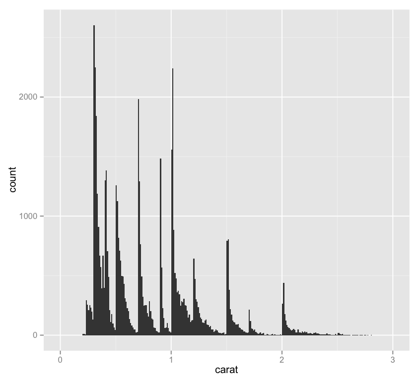
– Here’s the same visualization at the narrower bin width.
– It’s interesting, here we can see that although we have about as many .25 carat diamonds as we have 1 carat diamonds, the .25 carat cohort includes quite a lot more Ideal cut gems. I wonder if this is a natural consequence of being a bit smaller, or if “lesser” cuts of smaller diamonds are discarded or used in other ways more frequently, which would throw off the ratio, since the 1 carat bar doesn’t look so far off of the other spikes.
Code:
library(ggplot2)
qplot(carat, data=diamonds, geom="bar", fill=cut, binwidth=.04, xlim=c(0,3))