(This Post is part of my 30 day Data Visualization Challenge – you can follow along using the ‘challenge’ tag!)
Back on Day 6, my buddy Ben asked:
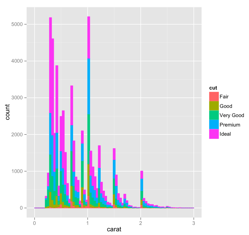
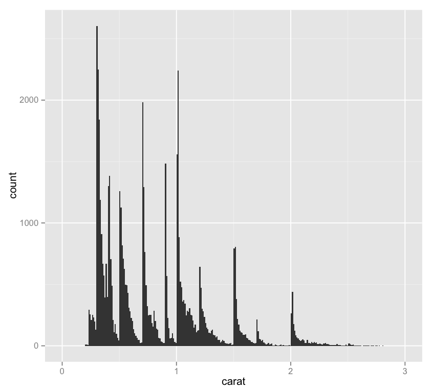
There’s a lot more data down in the sub 1.0 carat range than above. What happens when you restrict the set to less than a carat?
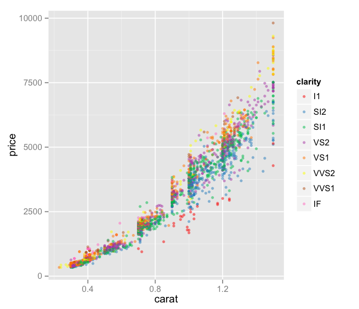
Let’s take a look! You’ll recall that on Day Six we were looking at only the diamonds of the J color – my favorite, I always root for the underdog – viewing carat v. price with each point’s color indicating its clarity.
Thoughts:
– Also at Ben’s suggestion, I’ve started reading about Brewer Color Scales, which are really interesting, useful, and all around awesome.
– We’ve reduced our area to only “J” color diamonds below 1.5 carats – a bit more than requested but I was curious!
– I’ve also added an alpha value, which helps us to deal with the dot density a bit. It essentially sets the opacity of a single point, so areas of lower density can be more easily identified, since they’re a bit faded.
– This visualization is not great. It’s sort of hard to see what’s happening here. There must be a better way to display this in a way that can provide some insights.
Code:
library(ggplot2)
jsmall <- subset(diamonds, color=="J" & carat <= 1.5)
plot.j.small <- qplot(carat, price, data=jsmall, color=clarity, size=I(1.5), alpha=I(.5))
plot.j.small + scale_color_brewer(palette="Set1")