Category: Work

DVC Day 3

(This Post is part of my 30 day Data Visualization Challenge – you can follow along using the ‘challenge’ tag!)

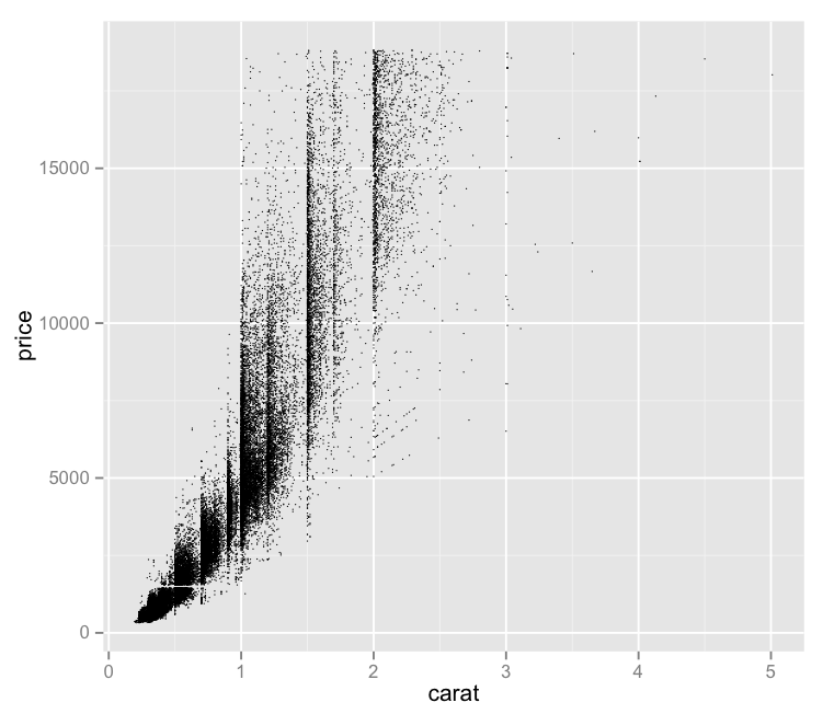
After plotting the full dataset on a price vs. carat graph, one of the problems that occurred was this idea of dot density – proper data scientists probably have a more technical term for it. That is, with so many data points, it’s hard to tell how “deep” a dot is, since a visible dot may represent a larger number of data points.

It seems like one possible solution would be to reduce the size of each dot – since each dot’s size may be causing it to visually encroach upon nearby data points, making the graph less visually useful. So, I tried that:

W-OdoQsbso-1200x1200

Pros:
– Offers a bit more nuance to the visual distribution of price vs. carat.
– Maintains the interesting vertical separations

Cons:
– This isn’t really a solution – with this number of data points, we still experience these big ink blots of imprecise “Well, there’s lots.” areas.
– It bothers me that “price” is vertical still. I forgot about that.
– The small size of the dots makes it tough to quickly distinguish outliers from a dirty laptop screen.

Code:

library(ggplot2)
qplot(carat, price, data=diamonds, size=I(1/3))

DVC Day 2

(This Post is part of my 30 day Data Visualization Challenge – you can follow along using the ‘challenge’ tag!)

Yesterday, I plotted the distribution of price among the diamonds dataset. One of the cons was that it showed the price distribution, but failed to really indicate any reasoning or correlations that might help us understand _why_ the prices were the way that they were.

To add some more depth, I’ve plotted price on the y-axis and carat on the x-axis:YVMu-ibRnV-1200x1200

If you’ve spent any time with this dataset (or R tutorials) you’ve likely seen this visualization before.

Pros:
– Gives us more context about what might be driving price
– Has some interesting vertical separations
– Looks like it may indicate a trend

Cons:
– The density of points makes it hard to tell whether a dot is one data point deep or 300 data points deep
– It bothers me that “price” is vertical
– What are those vertical separations about?

Code:

library(ggplot2)
qplot(carat, price, data=diamonds)

DVC Day 1

(This Post is part of my 30 day Data Visualization Challenge – you can follow along using the ‘challenge’ tag!)

For the first visualization, I kept it very simple:

lqB4fx5kCg-3000x3000

Pros:
– Easy to read
– Provides some value: we can see that price does not have a normal distribution, but rather a positively skewed leptokurtic distribution. I am only 70% sure I’m using these words correctly. (Thanks Professor Field!)

Cons:
– Not really very interesting
– Pretty ugly
– Does not explain what determines price, only what the prices are.

Code:

library(ggplot2)
qplot(price, data=diamonds)

30 Days of Data Visualization Challenge

Processed with VSCOcam with hb2 preset

As I work my way through Discovering Statistics Using R and discover other R-related gems across the internet, I realize that I’m only going to get better at this software if I spend time using it.

As such, I’m challenging myself to do a new visualization of a single database every day for the next 30 days – starting today, April 15, and ending May 15. The goal of this is to become more familiar with the R language, more specifically the ggplot2 library, and to think about visualizing data more generally.

The data set I’ll be using is the “Diamonds” data set package with ggplot2.

Check Your Meez

Mise_en_place_for_hot_station

From Bourdain’s Kitchen Confidential:

Mise-en-place is the religion of all good line cooks. Do not fuck with a line cook’s ‘meez’ — meaning his setup, his carefully arranged supplies of sea salt, rough-cracked pepper, softened butter, cooking oil, wine, backups, and so on.

As a cook, your station, and its condition, its state of readiness, is an extension of your nervous system…

The universe is in order when your station is set up the way you like it: you know where to find everything with your eyes closed, everything you need during the course of the shift is at the ready at arm’s reach, your defenses are deployed.

Mise-en-place is not just for cooks – one thing I’ve learned working remotely for almost two years is that if my meez is thrown off, or I let it get thrown into disarray during my workday, it disrupts my flow and makes my whole day a bit more stressful. Keeping things in order, digitally, is just as important as the physical space in the kitchen.

For me, that means being vigilant about my desktop usage – I use three desktop spaces on my Mac at all times. One for communication, where Slack, Skype, and other tools like that hang out. The middle desktop is where the work happens – and only The Work. If I am digging through an analytics report, or posting on an internal blog, or talking with our customers, that’s all I’m doing. I know that if I want to check Facebook, or Slack, or whatever else, I’d have to swipe to the third desktop – and that piece of mental friction helps keep me focused.

The third desktop, that’s for Rdio and anything else that’s not communication or The Work. Twitter, feedly, that sort of thing.

I’ll admit it – sometimes I’ll open Hacker News, or Quora, or Rock Paper Shotgun in my work Desktop – and it throws me off every time. It isn’t a distraction, it’s pollution. It’s as though I’ve mixed up the tomato bin with the sliced cucumbers – it throws me off and creates a hitch in my step.

Think about your meez – take it seriously. Staying focused and staying organized can be the difference between success and stress – at least if you’re an insane person like me.