Author: Simon

DVC Day 17: Who you calling a box plot?

(This Post is part of my 30 day Data Visualization Challenge – you can follow along using the ‘challenge’ tag!)

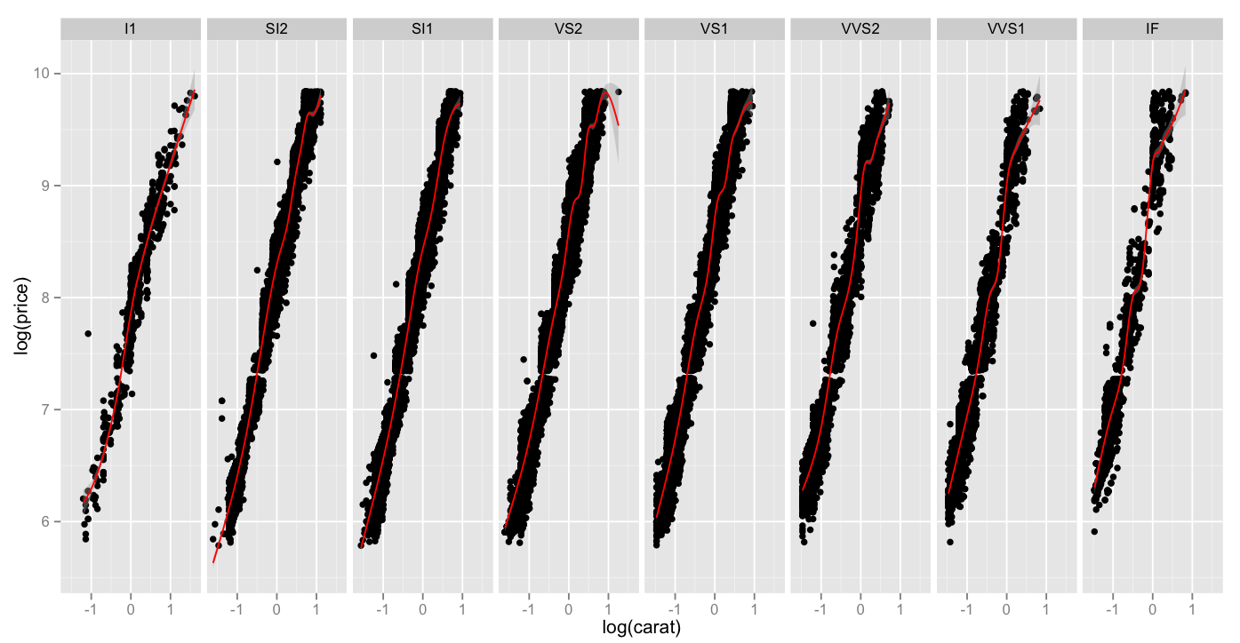
This one’s a request! My friend Jesse suggested I do a bit of a dive into box plots – and the timing couldn’t be better. You’ll recall from yesterday, it looked like a predictable way to make assumptions about price per carat was to consider a stone’s clarity – when we take the same data and compose it into the same graph – price per carat vs. carat split by clarities – check it out:

Screen Shot 2015-04-28 at 5.17.36 PM

Thoughts:
– Let’s be honest: box plots are not sexy.
– They are also not super intuitive. A box plot (or, more formally, a box and whisker plot) represents a few pieces of data: the box itself represents the first, second and third quartiles of a data set, with the center line representing the median (aka the second quartile – TIL!). The top and bottom whiskers extend to a value that is within 1.5 * IQR of the hinge, where IQR is the inter-quartile range, or distance between the first and third quartiles. If you’re still reading, here’s the Wikipedia page. Any data points that fall outside of the whiskers are officially outliers, and are marked with points.
– What this does illustrate is that while the rightmost clarity does indeed reach for the stars when it comes to price per carat, the stones are not reliably massively priced – in fact the median price is not seriously different from the other clarities.
– The real workhorse in terms of price per carat turns out to be the second from the left, with the highest median value.
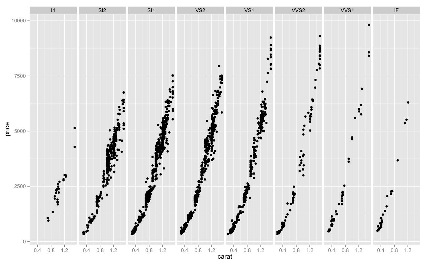
Here’s the same graph with some tiny blue points from yesterday’s graph.

Code:

> library(ggplot2)
> boxplot <- ggplot(diamonds, aes(carat, price/carat)) + geom_boxplot()
> boxplot + facet_grid(. ~ clarity)

DVC Day 16: Over Halfway

(This Post is part of my 30 day Data Visualization Challenge – you can follow along using the ‘challenge’ tag!)

I am seriously spending a lot of time thinking about diamonds, you guys. One thing that I’ve asked myself is about value – or rather, price. Are there reliable ways to tell if a particular diamond will be more expensive? Are there certain clarities or colors with more outliers or deviations in general? Looking at you, J. Here’s one way to answer that question, by looking into price per carat mapped against carat weight, split up between clarities:

Screen Shot 2015-04-28 at 5.02.04 PM

Thoughts:
– We can see that even though the leftmost diamonds tend to be the largest, the price per carat paid per carat for them stays roughly equal as they increase in size.
– We can also see that as we progress to the right, there are fewer diamonds per set (probably, the dot density is a problem here), but the cost per carat climbs skyward, peaking at almost four times per carat compared to the leftmost clarity.
– This doesn’t do a great job of representing deviation from the norm, though. There is probably a better way to represent that visually.

Code:

> library(ggplot2)
> qplot(carat, price/carat, data=diamonds, alpha=I(.25)) + facet_grid(. ~ clarity) 

DVC Day 15: Request #3!

(This Post is part of my 30 day Data Visualization Challenge – you can follow along using the ‘challenge’ tag!)

In chatting a bit with another friend and colleague, Martin, he suggested that I look into two things – applying the diamonds data set to a spider chart, to more clearly illustrate exactly how differences look across sets, and to look into log-log plots.

It turned out, for a few reasons, that spider charts are a bit out of my pay grade (for now), but log-log plots are actually very interesting, and can totally show us something kind of interesting.

If, like me, you haven’t thought about logarithms in a dog’s age, here’s an article on Forbes that can get you started down the rabbit hole. The oversimplified and probably incorrect TL:DR is this – a standard hockey-stick up-and-right graph can be very useful to show change that is occurring, but sometimes a log-log plot can more clearly illustrate _the rate of change of that change._

That is, a company may be growing, but is the rate of growth accelerating?

Here is a chart of log(carat) vs. log(price), which as you recall, when compared in a non-log format, had a pretty classic hockey-stick shape. When we compare the same values in a log-lot plot, here split up across clarities and a red smoothing geom applied, we can see that while all clarities move up-and-right as the carat weight increases, high clarities do so _at a faster rate_.

Screen Shot 2015-04-27 at 8.42.49 PM

Thoughts:
– I got ahead of myself and sort of dumped all my thoughts above the graph today. Sorry!

Code:

> library(ggplot2)
> log.facet <- ggplot(diamonds, aes(log(carat),log(price))) + geom_point()
> log.facet + facet_grid(. ~ clarity) + geom_smooth(color="red")

DVC Day 14: Request #2

(This Post is part of my 30 day Data Visualization Challenge – you can follow along using the ‘challenge’ tag!)

Responding to a comment (again from Ben!) on Day 11, I’ve used the more atomic plotting function of ggplot to break the data into another separate facet_grid – which definitely helps to illustrate (a little) the relationship between clarity and price on J colored diamonds:

Screen Shot 2015-04-25 at 8.30.09 PM

Thoughts:
– This may be less colorful, but it is a much more clear representation of the data at hand – we can see that as we progress from left to right, the apparent upward slope of price becomes steeper.
– It’s interesting that there is a real density change in the 2000-5000 price as we move from left to right – that’s where the lion’s share of column 2, 3 and 4 are, but in 5, 6 and 7 they narrow out. Maybe this is a cultural thing, re: pricing expectations for certain clarities?

Code:

> library(ggplot2)
> jsmall <- subset(diamonds, color=="J" & carat <= 1.5)
> j.facet <- ggplot(jsmall, aes(carat, price)) + geom_point()
> j.facet + facet_grid(. ~ clarity)