DVC Day 10: Stacks on Stacks

(This Post is part of my 30 day Data Visualization Challenge – you can follow along using the ‘challenge’ tag!)

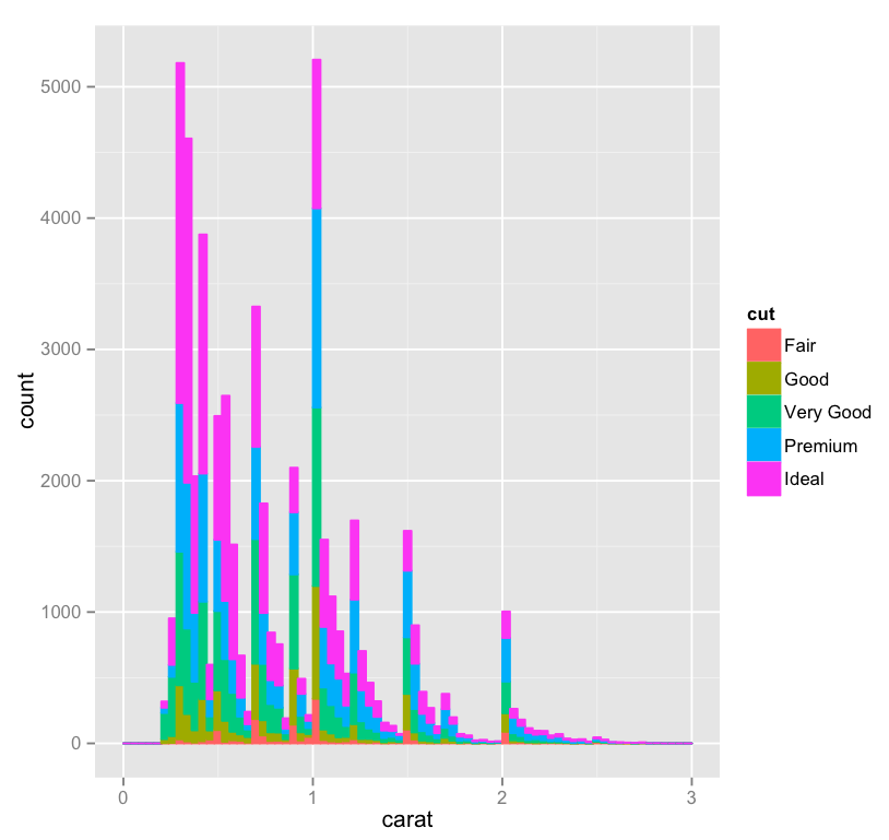
One third of the way through! I’ve played a bit with yesterday’s histogram and done two things – added ‘cut’ as a fill, and widened the bin a bit, just for looks:
Screen Shot 2015-04-20 at 8.29.07 PM

Thoughts:
Here’s the same visualization at the narrower bin width.
 It’s interesting, here we can see that although we have about as many .25 carat diamonds as we have 1 carat diamonds, the .25 carat cohort includes quite a lot more Ideal cut gems. I wonder if this is a natural consequence of being a bit smaller, or if “lesser” cuts of smaller diamonds are discarded or used in other ways more frequently, which would throw off the ratio, since the 1 carat bar doesn’t look so far off of the other spikes.

Code:

library(ggplot2)
qplot(carat, data=diamonds, geom="bar", fill=cut, binwidth=.04, xlim=c(0,3))

The Future of the Toyota Production System

p6-toyota-a-20140408-870x608

“What Akio Toyoda feared the company lost when it was growing so fast was the time to struggle and learn,” said Liker, who met with Toyoda in November. “He felt Toyota got big-company disease and was too busy getting product out.”

via ‘Gods’ edging out robots at Toyota facility | The Japan Times.

Seems like there are always lessons to be learned from Toyota – interesting to see a perspective about running a business that looks at the downside of speed, the downside of a product focus.

DVC Day 9: Bin What?

(This Post is part of my 30 day Data Visualization Challenge – you can follow along using the ‘challenge’ tag!)

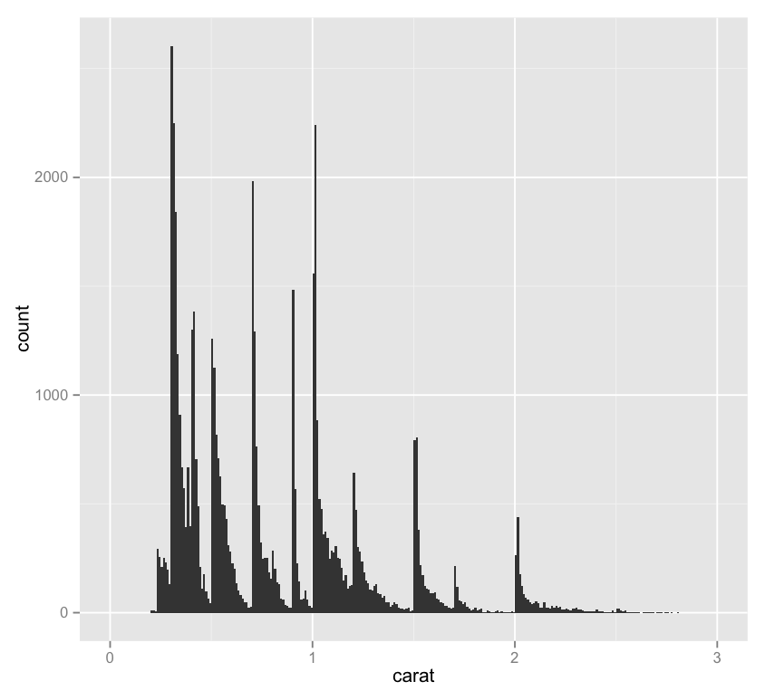
Testing our earlier hypothesis that the vertical striations in our data were due to a preference for “whole” carat numbers – or at least more readable numbers, we can look at a single-variable histogram:

Screen Shot 2015-04-20 at 8.19.26 PM

Thoughts:
– One interesting thing about this chart is the importance of binwidth, which sets the resolution of the data in a histogram – for instance, here’s this same chart with a binwidth of .15 rather than .01. It loses a lot of the utility of the chart above!
– It might be interesting to display a second variable here in a way other than on the y-axis – as a color maybe.

Code:

library(ggplot2)
qplot(carat, data=diamonds, geom="histogram", binwidth=.01, xlim=c(0,3))

DVC Day 8: Messin’ with (More) Geoms

(This Post is part of my 30 day Data Visualization Challenge – you can follow along using the ‘challenge’ tag!)

In playing a bit more with the qplot geoms call, I spent some time with the “jitters” geom, which has nothing to do with coffee, as it turns out. Jittering is a neat method to fight against the same sort of dot density that we saw earlier in the challenge – it creates a larger space for points to be plotted, which makes a visualization more readable. Here’s this same visualization without the jittering.

tXFnUXRYOl-3000x3000

Thoughts:
– The more I do this, the more I realize I don’t know about diamonds.
– The more I do this, the more I realize I don’t yet understand about R and visualizing data. It’s exciting!
– There’s a consistent pattern to the clarity layers that we see, repeating what looks like 3 times, yellow, green, blue, pink, and then again, and then a third time, with pink sort of stretching skyward. What’s that about?
– The “J” color continues to be interesting to me – why is it so jumbled up when the others seem to be at least somewhat orderly? It also reaffirms our previous findings, where we noticed that “J” diamonds seemed to be outliers (in a bad way) on the price vs. carat chart.

Code:


library(ggplot2)
qplot(color, price/carat, color=clarity, data=diamonds, geom="jitter")

DVC Day 7: Messin’ with Geoms

(This Post is part of my 30 day Data Visualization Challenge – you can follow along using the ‘challenge’ tag!)

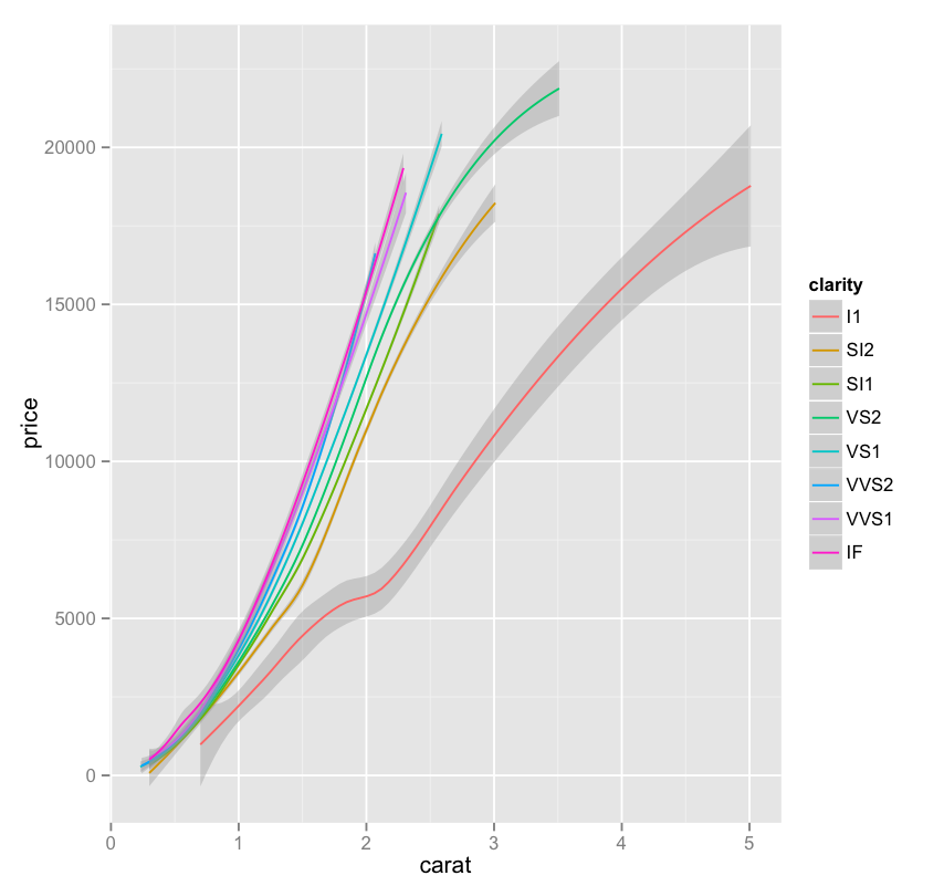
In noodling around with the different options of the qplot function (and there are plenty), I found myself going back and forth on the geom option – here’s one of the possible inputs, smooth, which takes us from yesterday’s graph to one of just very smooth lines, with a shading indicating the standard deviation of that particular collection of data:


nZnlIFK9Qn-3000x3000

Thoughts:
– This is a really interesting example of another case where we trade some visual precision for more visual utility – for example,that same graph using arguably more a more precise plotting of lines looks like a total, and useless, mess.
 The green line is particularly interesting, since it appears to plateau at a certain point – about the same place where it is the only remaining clarity.

Code:


library(ggplot2)
only.j <- subset(diamonds, color=="J")
j <- qplot(carat, price, data=only.j, color=clarity, geom=c("smooth"))
j