Tag: data

Pies and Waffles: Delicious Charts

I’m trying to catch up on my massive Pocket back scroll, and in surveying the massive and diverse landscape of its contents, noticed a few pieces all from the same site,  eagereyes, and all on the same topic, pie charts.

So, naturally, I read them. 

(As a sidebar, am I the only person who struggles with this with Pocket, or other content saving services? Am I coining the term “Pocket Zero” right now? Am I the next Merlin Mann? )

Here are the pieces – they’re all quite short, less than ten minutes reading, even if you do take in the discussion with Hadley Wickham in the comments section:

A Pair of Pie Chart Papers
Ye Olde Pie Chart Debate
Pie Charts
One thing I was surprised to learn was just how long the Great Pie Chart Debate has been going on – over a hundred years! And yet,  the pie chart lives on. 

It’s also interesting to me that,  despite their ubiquity in popular media, we don’t have a great sense of how or why we perceive pie charts the way we do – it makes me consider firing up the Doc’s eye tracker, just to see how eye patterns map onto different visualizations.

In this series of posts I was also introduced to the Waffle package for R, which makes it easy to put together a pie chart alternative which I quite like – like this:

It strikes me as easier than a pie chart to compare each of the pieces to one another, and indicates that each point is part of a continuous whole in the same sort of way that a pie chart does. 

I’m excited to play around with this package some in the coming days. I’ll have to dig a bit and see if it’s supported in Shiny yet!
 

SupConf Talk Rehearsal Recording

If you weren’t able to make the first ever SupConf in San Francisco this week (and today’s the second day!) , here is a previously recorded rehearsal for the talk – not quite the same as being here, but I hope valuable! I am not 100% certain if there will be a recording of the live talk available, but if it is, I’ll share that once it’s in my hands as well.

Use the Data You Have: Answer Your Questions

As discussed in the Previous Post in this series (Ask the Right Questions), before you set foot in your Analytics suite, you need to have some idea of the questions that you want to answer.

Eventually, when you’re a superstar with your analytics toolbox, you’ll be able to do some exploratory analysis  – jumping in without a hypothesis or a ready understanding of what you’re looking for. For your first steps as a data driven support professional, I’d recommend having your question (or questions) ready to go.

For the purposes of this series, we’ll do a (very) brief overview of navigating through Google Analytics, and a tiny bit on Mixpanel. It’s important that you become a confident and competent practitioner of your particular toolset. If it’s Google Analytics, get certified.

(Here’s mine!)

Let’s consider the hypothesis from our last Post;

If it is true that our customers want plugins for their site, we would expect that “plugins” would be a top search term in our knowledge base. It would also be a top tag in our chat transcripts. It would also come up more frequently than other support topics in our public forums.

Knowing the way that things are arranged at WordPress.com, I can verify or deny each of these pieces with different tools. Tag transcripts I could find from our live chat software provider. I could search the Forum, or do a big text scrape. For the knowledge base piece, I can use Google Analytics, since our documentation is all recorded there.

For the best argument, you’ll want to use all of your opportunities to verify – that way you can be as certain as possible that you’re making the right call.

Let’s open Google Analytics. Once you’re in your site or app’s Dashboard, you’re going to see a LOT of information. On the left hand sidebar you’ll see a number of tabs like this:

Screen Shot 2016-05-18 at 8.20.23 PM.png

For most of the work you’ll be doing, the Behavior tab is your friend – much of the rest of the Analytics suite can be useful for support, but would require maybe more digging than we’re ready for, or possibly would require committing additional code in order to track more nuanced behavior.

Since our question is about customers being interested in plugins, one way for us to check our hypothesis would be to see how traffic our support documentation on plugins compares to other support documentation. We know the URL for that document ( https://en.support.wordpress.com/plugins/ ) , so we want to expand Behavior and head into our Site Content > All Pages

Screen Shot 2016-05-18 at 8.25.35 PM.png

From here we’ll get a top ten listing of our most-visited locations, as well as a breakdown of Pageviews, Unique Pageviews, etc. Like so:

WPCOMGA1


OK! Now we’re getting somewhere – I’ve obscured the actual data here, but you can take my word for it that the /plugins/ page is not our most commonly visited support document, with less than 1% of our overall traffic. It is in the top ten, however.

I will note though, that the /com-vs-org/ doc (which describes the offerings of WordPress.com versus self hosted alternative) is highly popular, and for many customers, the difference between WordPress.com and self hosted sites boils down to one thing: access to plugins.

When we take these two documents together, they represent more traffic than every document except /stats/ – but people do so love their Stats. That /plugins/ and /com-vs-org/ taken  together represent the second most visited support document is meaningful, for sure.

We do want to verify that these two documents are in fact related, and what we’re observing here is in fact noteworthy – we can do this in Google Analytics by selecting the Navigation Summary tab at the top, and selecting the /com-vs-org/ page:

WPCOMGA2

Now we’re getting somewhere – in comparing the flow, I see that one of the most common pages folks visit before /com-vs-org/ is /plugins/ – and it’s also one of the most common pages folks visit immediately afterward. I’d take this as sufficient evidence that our hypothesis is supported.WPCOMGA3
It’s highly important that you are careful not to overstate your case – what we can see here is traffic and its flow – we can’t be sure that this is positive or negative, or what impression customers are getting from these documents. It’s clear that there documents are related, and popular, but not necessarily what that means. 

This is why checking several sources and doing a second-level check is important – seeing not only where the traffic totals are, but also how the traffic flows between different pages or stages.

Representing this accurately and researching it thoroughly will help you to state your case accurately. Consider this example, a Mixpanel report of Failed Logins (on the top, in blue) vs. Signed In (successful logins):

Screen Shot 2016-05-18 at 8.40.22 PM.png

Holy moly, we have nearly twice as many failed logins as we do successful ones?! Somebody call the head office, this is a huge problem!

Approach it with curiosity and a desire for verification – imagine, if you fail to logon to an app or service, what’s the first thing you do? You try to log on again, right? Look how this chart changes when we go from “Total” to “Uniques:”

Screen Shot 2016-05-18 at 8.42.10 PM.png

The two have swapped places – yes, 6500 failed logins a day is not great, but it tells a much more measured story, and probably more accurate to your interests.

Answer your questions, but always verify.

The next and final Post in this series will be taking the answers you’ve found, and turning them into convincing arguments. See you soon!


Use the Data You Have: Explanation and Context

Most conference talks are the worst. We can acknowledge that, among ourselves, right?

Many folks don’t properly prepare, they don’t expend any care into their visuals, and they fail to bring anything like the kind of value that they could.

I’m not saying that people who present at conferences are the worst. By and large they’re actually the opposite – they’re some of the best and brightest and most interesting people in an industry, and that’s why they’ve been invited to speak at a conference.

(sometimes they’re even being paid to speak at the conference)

I think it’s more that socially, at least Americans, we conceive of public speaking the same way we conceive of learning mathematics. It’s like a light switch. You’ve got it or you don’t.

“I’m not a math person.”

That’s nonsense of course. But, it’s pervasive, and it unfortunately really sells us short on both ends – folks who have a ton of amazing things to say don’t use their voice because they think it’s simply the way, when it’s more a matter of work, and practice, and preparation.

The other side of the coin are the folks who think they’ve got it, that charisma, and preparation is for squares who don’t have it.

That’s nonsense, too, naturally.

This is a long way of providing context for a series of Posts I’ll be doing over the next few weeks. I’m speaking at SupConf later this month, and I am determined to provide a mountain of value to the folks who have travelled to San Francisco and trusted me with twenty minutes of their time. My talk is called Use The Data You Have. 

It’s about how customer support teams can create value within their companies and for their customers without running experiments or trying new and crazy stuff – just by using the data they already have.

One way I am assuring myself that I can provide some value is by creating the value way ahead of time, in the form of these blog posts, that will serve as a supplement to what I discuss in the talk.

(Don’t worry, they’ll be helpful in their own way as well, I’m not going to keep anything special away from folks who aren’t going to the conference, or are reading this in the future)

In some way this blog series is a way for me to hedge my bets: even if I completely mess up the presentation and look like a total buffoon, I’ll still be able to click through to my final splash slide and cry for redemption; look, look, all hope is not lost!

Plus, this series is going to be somewhat dry, with some screenshots and Google Analytics talk, which is important, but super dry and not at all suited for an in-person conference talk.

Watch this space!


Quartz, Atlas and the Y Axis

I’ve gone into a bit of a rabbit hole this weekend. One of WordPress.com VIP‘s biggest sites, Quartz, has a growing set of data visualizations, charts, graphs, etc, at their new branch, Atlas.

In poking around, I found myself at the Github repo for their visualization tool, Chartbuilder. This tool is pretty rad – if you have node on your computer you can run it locally, or you can also use their hosted version, here.

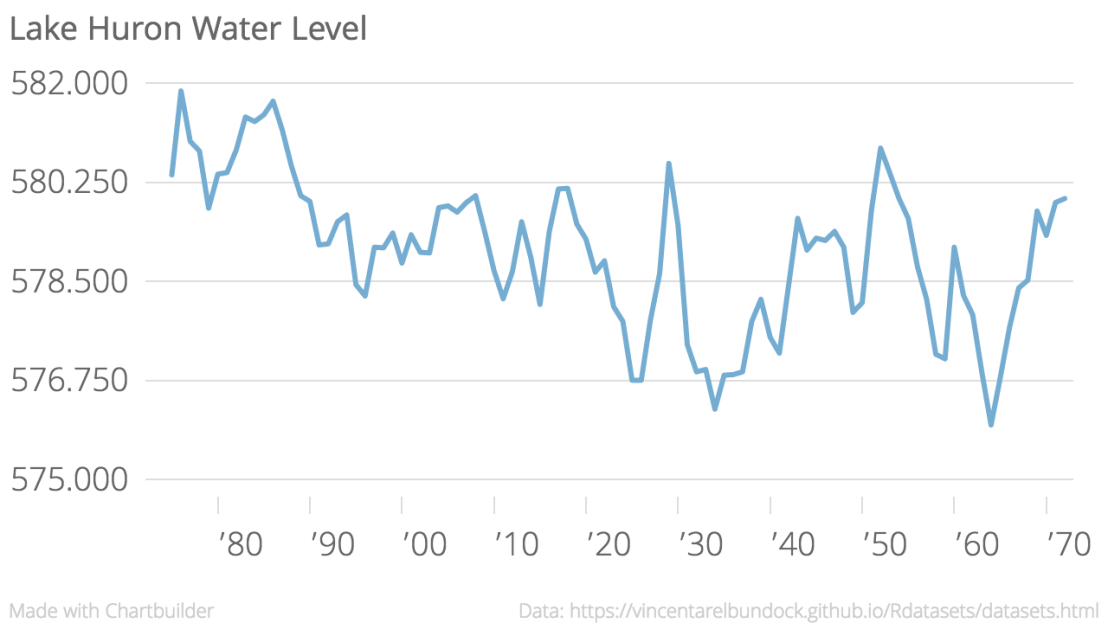
It took maybe six minutes to go from a CSV I’d never seen before (Lake Huron water levels) to a pretty nice little viz:

Lake_Huron_Water_Level_LakeHuron_chartbuilder (1).png

It offers a lot of flexibility, as well as simple ease of use. Anyone armed with a (properly formatted) CSV can go from numbers on a page to a useful visualization really quickly. I expect I’ll pick this up when I need something to go from numbers to graphic quickly, and the CSV is already nicely formatted.

I do love R and R Studio (ggplot2 for life), but sometimes I don’t want to spend much time tweaking something to be just-so, or searching Google (or Stack Exchange) for something I haven’t seen before.

One thing that’s worth bringing up, as data visualization becomes more accessible and easier for everyone to use, is this: going from a CSV to a chart can be an act of interpretation, and can create a message from the data that may skew your readers toward your perception.

(I’d argue that part of creating moral visualizations is presenting the data in a way that allows the individual to maintain positive liberty, but that’s a bigger discussion for another time)

Consider the viz above – you’d be understandably concerned about the water levels of Lake Huron – they do seem to be varying widely over the past century, and with a general downward trend.

This is a sneaky trick of the Y Axis – note that it only represents a span of eight feet. Look again, with the Y axis starting at 500:

Lake_Huron_Water_Level_LakeHuron_chartbuilder.png


… or, as some purists demand, with the Y axis starting at zero:


Lake_Huron_Water_Level_LakeHuron_chartbuilder (2).png


I am excited to mix Chartbuilder into my data toolbox, but remember well, dear readers: as visualization tools become easier to use and as the ideas of Big Data become stronger and stronger, there are lots and lots of ways irresponsible or malicious folks can weasel the facts.

Be vigilant out there, gang.

Also, happy Mother’s Day 🙂