Not long ago, my friends and yours at Support Driven held another survey for folks working in customer support roles in the tech community. As always, the results were really interesting, and I took a little time to visualize the data.
I’m going to try to stick to descriptions of methodology and then the visualization, without a ton of editorial content from yours truly – draw your own conclusions, please do comment below if you see something interesting 🙂
Disclaimer: I am not a statistician or a visualization professional. In order to keep things looking nice, I did have to drop an outlier – sorry line 137. This particular person took a pay cut of $70,000 since last year, and it was wrecking my plots.
As a remote worker (you guys know I work remotely right?), the first question I had was, “I wonder if fully remote employees are paid differently?” Since I had the data, I also colorized the points according to self-reported gender. Here’s that:

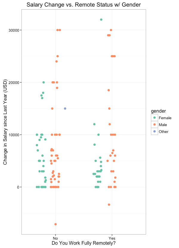
Next question: “I wonder if there is a difference between remote workers and non-remote workers in terms of annual salary gain?” – again, colored by gender.
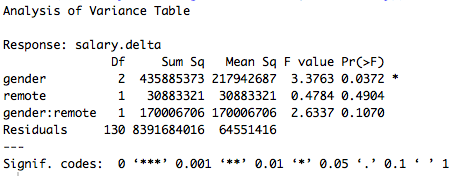
Yeah, I am not a statistician, but I took a stats class one time. This looked fishy to me, so, for the fun of it, I went ahead and ran an ANOVA on these results (specifically
anova(lm(salary.delta ~ gender * remote, data=survey))
.
Here’s that, in an image format since it’s tricky to copy-paste from R Studio:
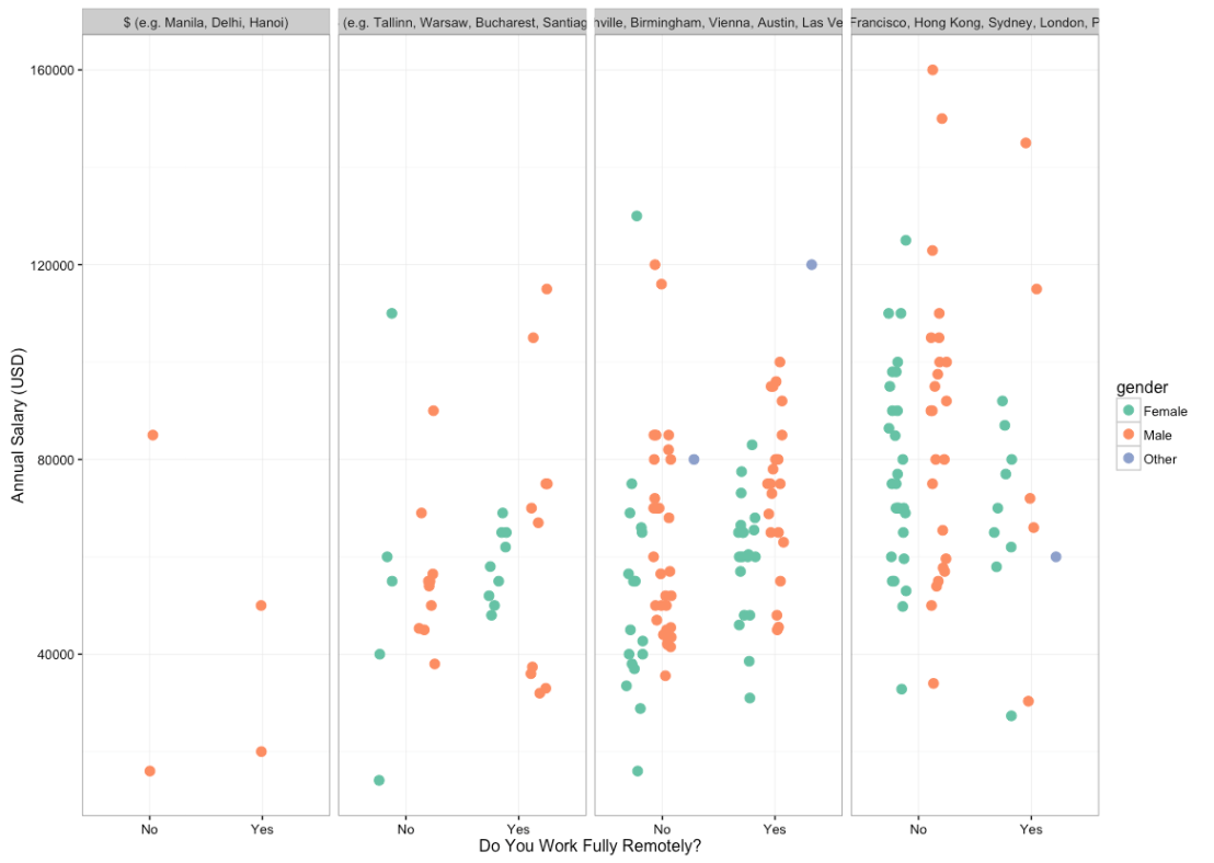
Since we were already on this journey, I also ran a couple faceted plots – here’s Annual Salary vs. Remote Status in all four cost categories – again, colored by gender:
Finally, here’s Annual Salary vs. Remote Status across all company sizes, colored by gender:

In the interest of separating out presentation from interpretation, here is some of what I get out of this:
“I wonder if fully remote employees are paid differently?”
This turns out to not be super clear – like most things in life, the answer is, ‘It depends.’ Here are the summary stats for Remote & Non Remote re: salary:
Remote:
Min. : 20000
1st Qu.: 55000
Median : 65000
Mean : 66897
3rd Qu.: 76500
Max. :145000
Non Remote:
Min. : 14093
1st Qu.: 50000
Median : 65441
Mean : 68940
3rd Qu.: 85000
Max. :160000
One way to interpret this is to look at the mean, and to say, “Well, non remote workers are on average making $2k per year more than remote workers, in this sample.” which is correct! They are! But, when we look at the median, it tells a different story. The mean as a measurement is highly sensitive to outliers, whereas a median is not.
With similar medians and with Non-Remote enjoying a higher 3rd Quartile and Max salary, we can see that the highest paid folks tended to be Non Remote. HOWEVER, look at the minimum and first quartile; the folks making below the median wage tended to make LESS when they were Non Remote.
This is illustrated well using a violin plot (not super prettified):

or with a density plot:

The gender piece is trickier. It’s clear that there is a significant link between salary and gender, and it does not appear to go away when we split things into different sized companies or across different locations.
It is kind of a bummer to see that the smaller companies (which I usually associate with greater equality) being some of the worst culprits here, though a larger sample would be really helpful in seeing if this is a real world thing or a just-our-sample thing.

Simon, these visualizations are super rad. I remember looking over the data from that survey, but got wayyy more out of it here.Thanks for putting this together!
Happy to do it 🙂